
CEABiGR Part 7
Gene methylation and expression mixOmics
I’m pausing working on tuning (again) so I can complete mixOmics analysis and determine which output plots are useful, especially because EPIMAR is coming up! I returned to this R Markdown script. For all of these explorations, I focused on the female data.
Visualizing sPLS results
Previously, I made PCA equivalents and arrow plots to visualize the sPLS results. I wanted to look through the mixOmics manual and determine if any other plots would be useful. While the bookdown manual is good for walking through the analysis, I found the graphics page to have good information about plot creation and interpretation.
The first plot I made was a correlation circle plot:
plotVar(geneResult.splsFem, cex = c(3,2), var.names = FALSE, cutoff = 0.8,
        title = "Female Correlation Circle Plot", legend = FALSE,
        X.label = "PLS Comp 1", Y.label = "PLS Comp 2") #Create correlation circle plot using 0.8 correlation cutoff. Variables that are close together are highly correlated. Variables with < 90º angle between them have a positive correlation, with variables having > 90º angle between them having a negative correlation. Variables at a right angle have 0 correlation.
ggsave("../output/gene-methylation-expression-mixomics/corrCircle-fem.pdf", width = 11, height = 8.5)

femCircCoordinates <- plotVar(geneResult.splsFem, plot = FALSE)  #Save coordinates
head(femCircCoordinates)
Figure 1. Female correlation circle plot. Methylation driver genes are blue and expression driver genes are orange.
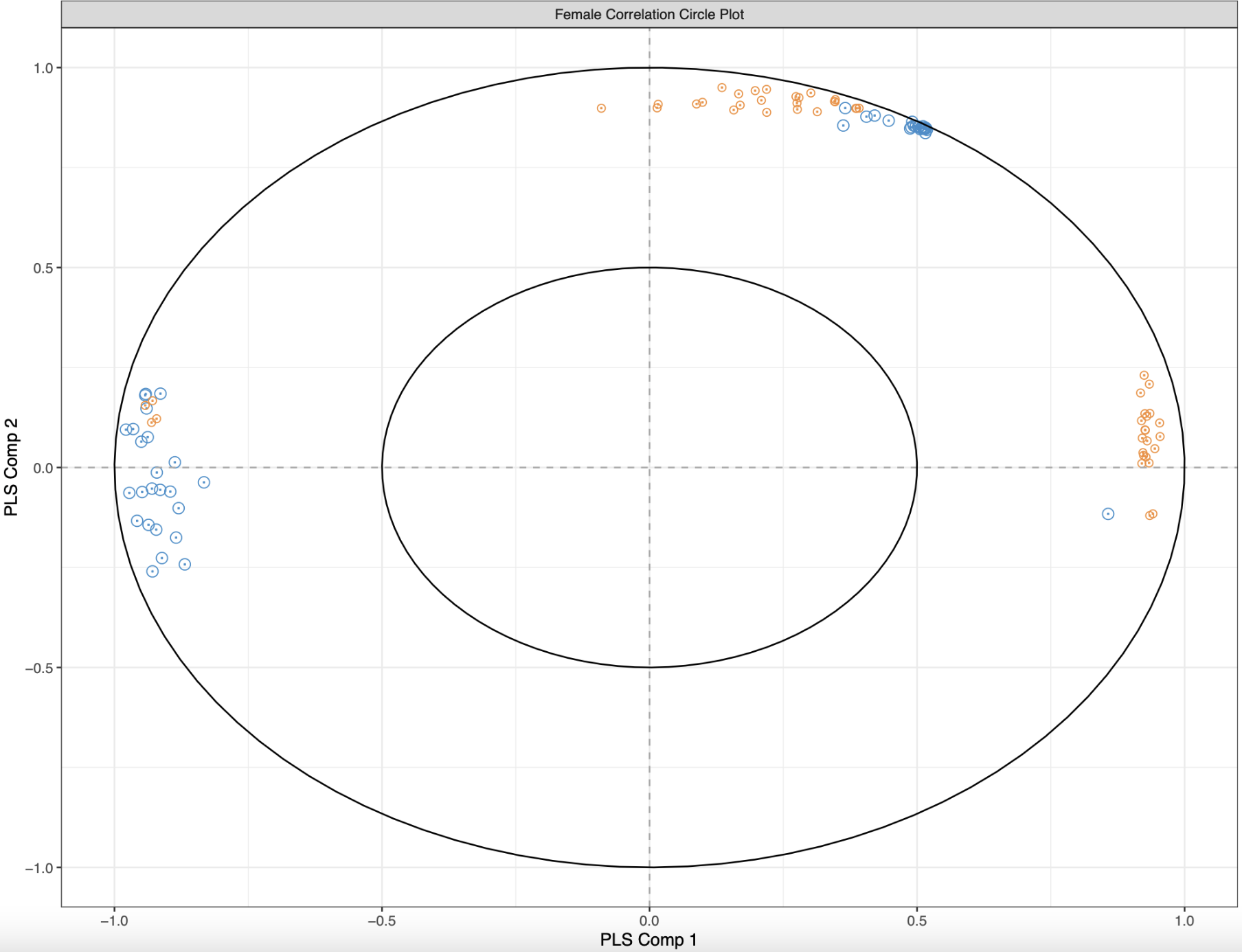
Each dot represents a gene that is important for differentiating control and low pH treatments, with blue representing methylation drivers and orange representing expression drivers. The distance between two points is indicative of their correlation, and I only plotted those that have a correlation of 0.8 and above. If two genes are highly correlated, they are closer together. Additionally, if two variables have an acute angle between them, then the correlation is positive. The opposite is true for obtuse angles. Visually, I see three groups of variables: some that are positively correlated, some that are negative correlated, and some with no correlation. But trying to compute angles between variables and distances is a bit much.
The next suggested visualization was a cim plot:
cim(margins = c(10,10), geneResult.splsFem,
    xlab = "Expression", ylab = "Methylation",
    save = "pdf", name.save = "../output/gene-methylation-expression-mixomics/PLScim-fem") #Show Pearson correlations between X and Y variables on the first component. Cell color is based on values of the similarity matrix.
Figure 2. Female cim plot for correlations between driving genes.
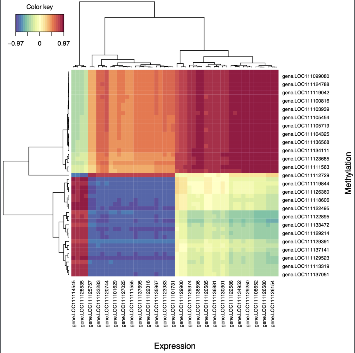
It’s a heatmap of Pearson correlations between driver genes for methylation and expression. I found this much easier to interpret, and it had a similar pattern to the circle plot (one group of positively correlated genes, one group of negatively correlated genes, and one group of uncorrelated genes). Interestingly, none of the driver genes for each dataset are the same!
To understand how these correlations interact with eachother I created network plots:
femNetwork <- network(geneResult.splsFem, cutoff = 0.8,
                row.names = FALSE, col.names = FALSE,
                color.node = c("grey50", "grey50"), shape.node = c("circle", "rectangle"), size.node = 0.2,
                color.edge = rev(brewer.pal(10, "RdBu")),
                save = "pdf", name.save = "../output/gene-methylation-expression-mixomics/network-fem") #Create and save network plot. Methylation = blue circles, expression = orange rectangles. Blue lines = neg corr, red lines = pos corr. Only use correlations > 0.8 cutoff. The network plot is split based on components

#size.node is only available with the developer version of mixOmics based on github issue 233: https://github.com/mixOmicsTeam/mixOmics/issues/233
Figure 3. Female network plot for all correlations > 0.8. Methylation drivers are circles and expression drivers are rectangles.
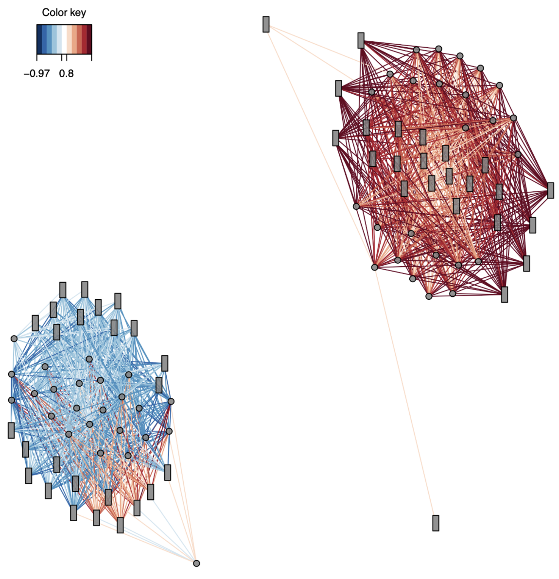
Okay, this is COOL. It shows two clear clusters: one positively correlated and one negatively correlated. Since there are no common drivers between the expression and methylation datasets, it suggests that methylation of one gene could influence expression of a completely separate gene.
Digging into components
It looks like each network is associated with a different PLS component. I extracted the important variables form each component using selectVar, and saved the gene name and loading value for each component. The output files can be found in this folder. I also used plotLoadings to create barplots for the loading values of each driver gene.
More importantly, I annotated the genes from each component so I could understand if each component had genes with unique functions. I took the blastx results from the C. virginica MBD-BS paper (found here on gannet) and matched them with GO-GOSlim information and the mRNA genome feature track. The positive correlation cluster had RNA metabolism and developmental processes as predominant biological processes and nucleic acid binding and transcription regulatory activity as predominant molecular functions. Predominant biological processes for the negative correlation cluster were signal transduction and cell organization and biogenesis, and predominant molecular functions were cytoskeletal activity and enzyme regulator activity. It’s interesting that the genes in each cluster have different functions! I need to dig more into the genes in each network and see if they’re known to be in the same biological pathways so I can groundtruth this analysis.
Going forward
- Tune sPLS parameters
- Determine if outlier sample should be removed
- Re-run sex-specific SPLS
- Update methods and results
- Dig into functional annotations for genes in networks
- Read gene expression variability papers
- Continue with gene expression variability analysis