
Correlating Technical Replicates Part 4
Continuing the PRTC confusion
Emma suggested a while back that I use my PRTC data to make NMDS plots for my technical replicates. The goal was to see if my PRTC data was messier or better than my sample data. If anything, it’s just confusing.
In this script, I made NMDS plots with my PRTC data four different ways.
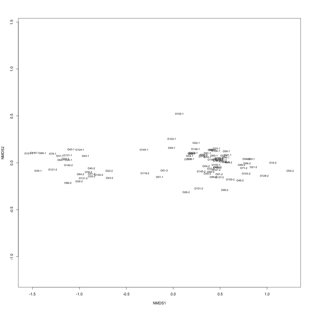
Nonnormalized data, log transformation: I couldn’t make a plot without normalizing or transforming! I got an error that indicated too many weights were negative or zero. There is very clear separation of samples into four batches. I believe that samples that were run back to back are clustered together. I need to go back through my notes, but this may also be related to batches of PRTC I used.
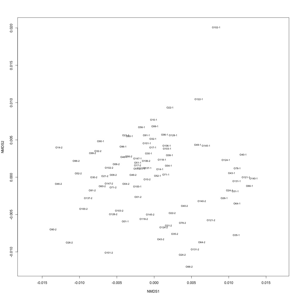
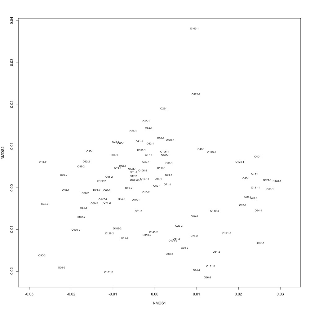
Nonnormalized data, autotransformation: Autotransformation produced a graph, but I’m not sure what it means. All of my samples are just clustered together in one large circle.
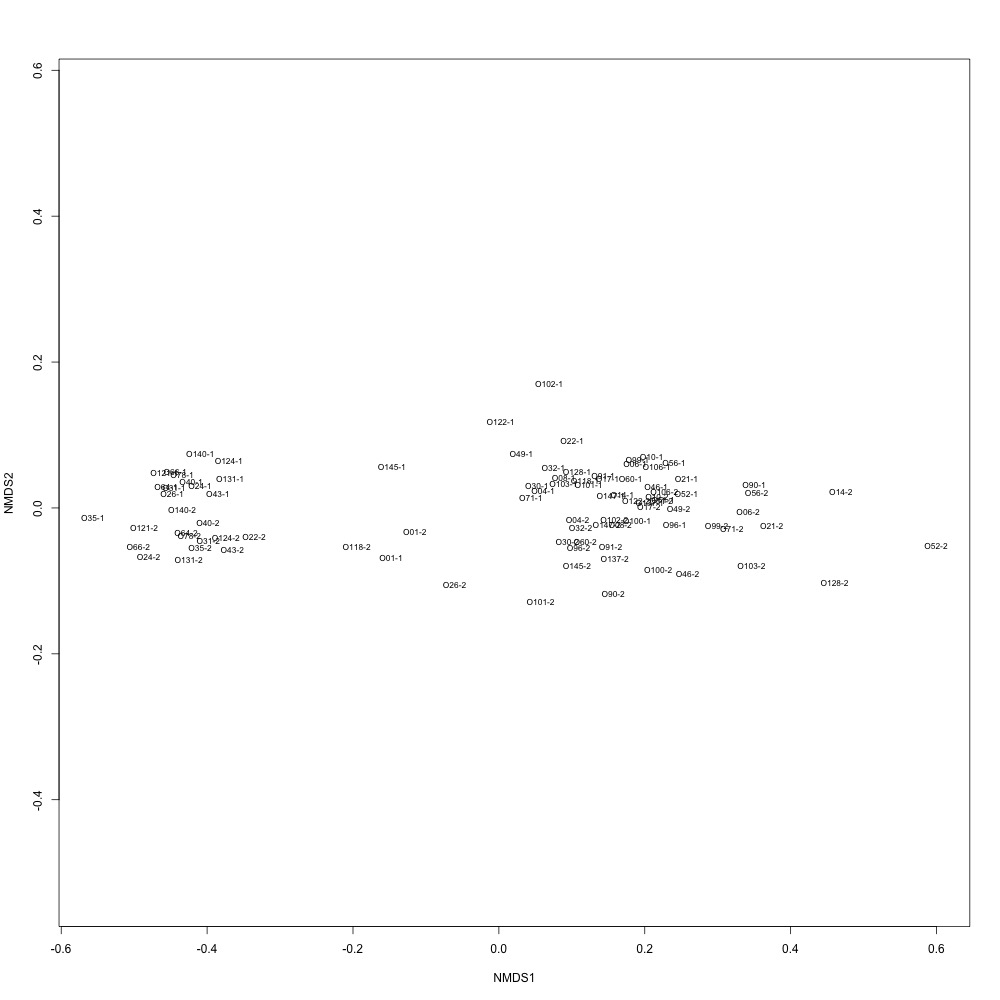
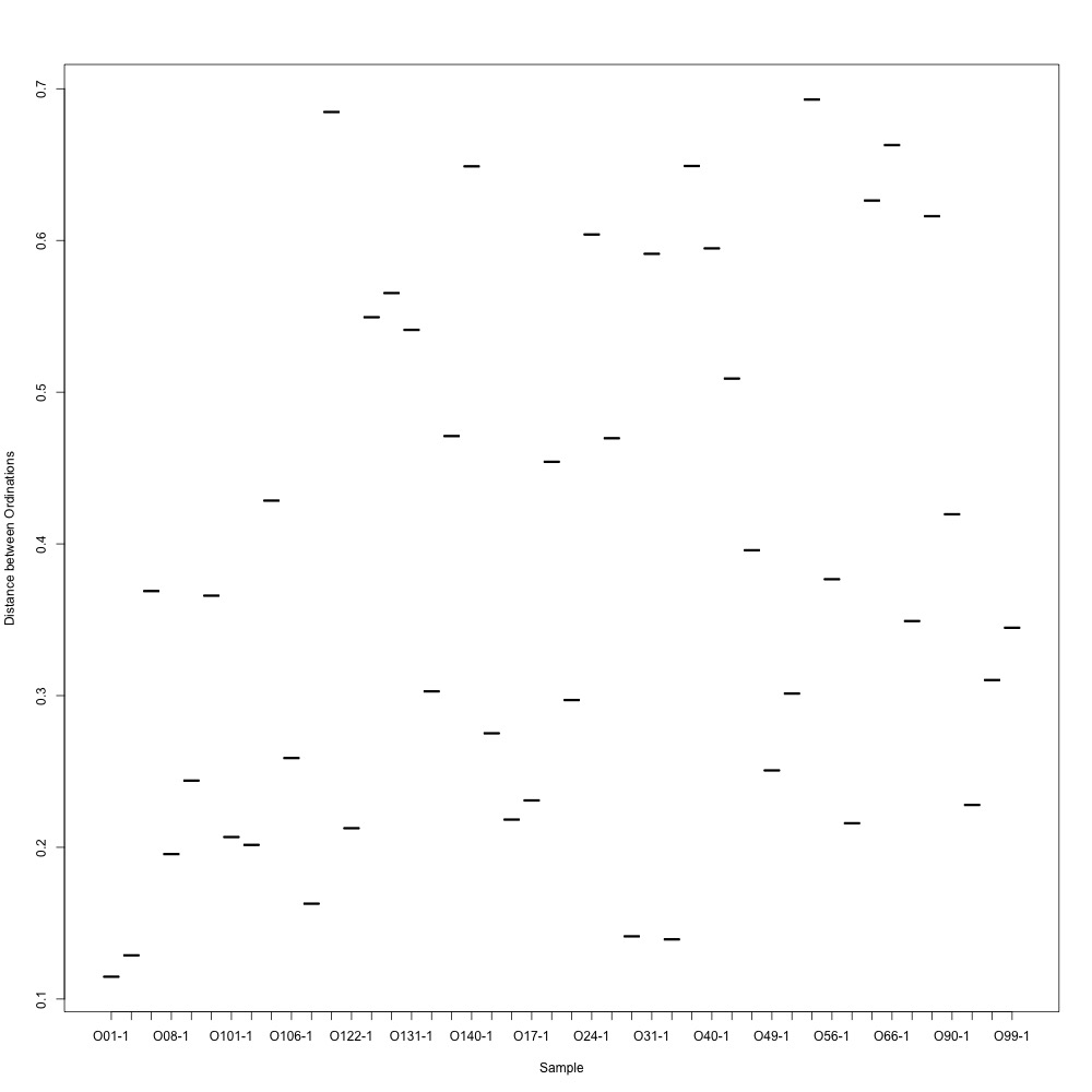
Normalized data, log transformation: This looked similar to the NMDS from my nonnormalized data, but the batch separation wasn’t as clear. For this graph, I also looked at ordination distances between technical replicates. It did not look good at all.
Normalized data, autotransformation: Again, not sure what it means.
Once again I’m left with more questions than answers. I’ll just wait to see what Emma thinks while investigating when I added PRTC.