
Green Crab Experiment Part 13
Temperature conditions within tanks
It’s time to delve into data! I’m starting by working on the HOBO data to ensure that my treatments were in fact different from eachother. The first thing I did was open the HOBO file for each logger and export the data as a .csv. I then manually combined the data from loggers 9 and 13. On the last day, heaters for tank 6 failed so I had to move crabs from tank 6 to tank 3 after we finished respirometry and sampling for the tank 3 crabs. I added the the logging information for T3 HOBOs to the T6 HOBO files after I moved the crabs.
I then created this script for the temperature analysis. I imported each .csv, retained only the date/time and temperature information, and formatted the date and time correctly for R. I then used for loops to combine data from replicate loggers within a tank and calculate mean ± SE temperature for each tank, and saved this information here. Just looking over these values, the mean ± SE for replicate temperature tanks overlapped, so there does not seem to be differences between these replicates:
- Ambient: 13.8 ± 0.9
- Cold = 5.7 ± 0.4
- Elevated = 30.8 ± 2.4
To confirm our treatments were in fact different, I conducted a one-way ANVOA of temperature by treatment.
tempANOVA <- aov(temp ~ treatment, data = tempDataLong) #One-way ANOVA by treatment
summary(tempANOVA)[[1]][4][[1]][1] # F = 42002.94
summary(tempANOVA)[[1]][5][[1]][1] # P-value = 0
Finally, I plotted the temperature data over the course of the experiment. I need to fix the x-axis still, but I did learn how to effectively use ggplot and patchwork to create multipanel plots! The ggplot book was super useful for understanding the different syntax and options. To create the dataframe allTemps I used for the plot, I used cbind.na from qpcR to combine columns with different numbers of rows so I could calculate the mean temperature for each treatment using rowMeans.
#Create individual plots for each temperature
warmPlot <- ggplot(data = allTemps) +
  geom_ribbon(aes(x = dateTime, y = avgWarmTemp, ymin = warmMean - warmSD, ymax = warmMean + warmSD), fill = plotColors[1], alpha = 0.15) +
  geom_line(aes(x = dateTime, y = avgWarmTemp), color = plotColors[1]) +
  geom_hline(yintercept = 30.8, colour = plotColors[1], linetype = 3) +
  labs(x = "", y = "") + scale_y_continuous(breaks = seq(23.5, 32.5, 3)) +
  theme_classic() + theme(axis.line.x = element_blank(),
                          axis.ticks.x = element_blank(),
                          axis.text.x = element_blank(),
                          axis.text.y = element_text(size = 13),
                          plot.margin = margin(2,0,1,0))
ambientPlot <- ggplot(data = allTemps) +
  geom_ribbon(aes(x = dateTime, y = avgAmbientTemp, ymin = ambientMean - ambientSD, ymax = ambientMean + ambientSD), fill = plotColors[2], alpha = 0.15) +
  geom_line(aes(x = dateTime, y = avgAmbientTemp), color = plotColors[2]) +
  geom_hline(yintercept = 13.8, colour = plotColors[2], linetype = 3) +
  labs(x = "", y = "Temperature (ºC)") + scale_y_continuous(limits = c(12, 16), breaks = seq(12, 16, 1)) +
  theme_classic() + theme(axis.line.x = element_blank(),
                          axis.ticks.x = element_blank(),
                          axis.text.x = element_blank(),
                          axis.text.y = element_text(size = 13),
                          axis.title.y = element_text(size = 20),
                          plot.margin = margin(2,0,1,0))
#Cold: Mean = 5.666688, SD = 0.3637059
coldPlot <- ggplot(data = allTemps) +
  geom_ribbon(aes(x = dateTime, y = avgColdTemp, ymin = coldMean - coldSD, ymax = coldMean + coldSD), fill = plotColors[3], alpha = 0.15) +
  geom_line(aes(x = dateTime, y = avgColdTemp), color = plotColors[3]) +
  geom_hline(yintercept = 5.7, colour = plotColors[3], linetype = 3) +
  labs(x = "", y = "") + scale_y_continuous(limits = c(5, 7.5), breaks = seq(5, 7.5, 0.5)) +
  theme_classic() + theme(axis.text = element_text(size = 13),
                          plot.margin = margin(2,0,1,0))
warmPlot / ambientPlot / coldPlot #Assemble individual plots using patchwork
ggsave("exp-temp.pdf", width = 11, height = 8.5)
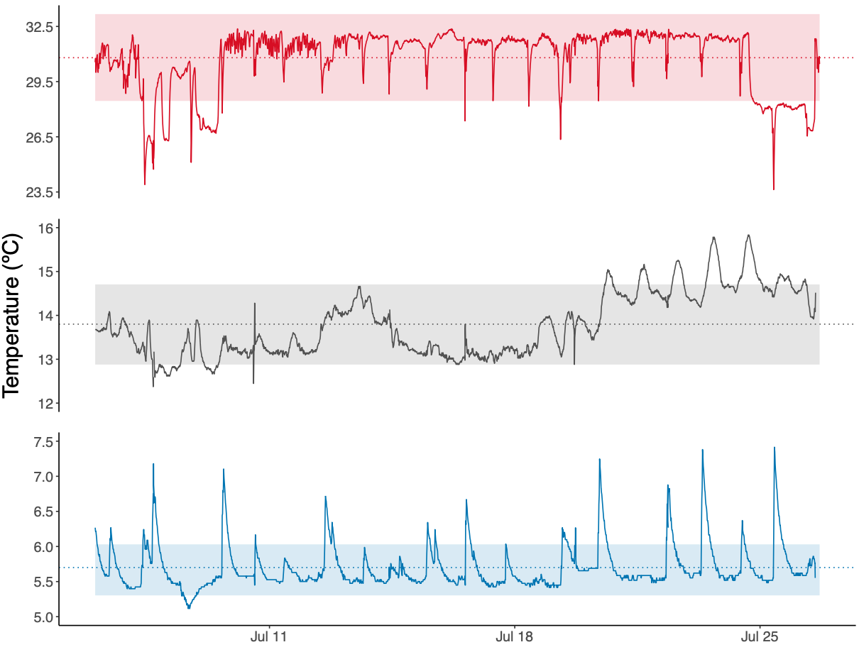
Figure 1. Temperature during the exposure period (can also be found here)
Going forward
- Schedule for analyses and extractions
- Update methods
- Update results
- Survivorship analysis
- Sex ratio and size analysis
- TTR analysis