
MEPS Revisions Part 4
Using simper and new figures
I spent most (yes……most…………RIP) of the past two days revising my ordinations and creating ordination figures. Sidenote: I also ordinated means and variances separately as per Julian’s suggestion.
simper
During my meeting with Julian on Friday, he suggested I use simper to identify loadings that contribute to any significant ANOSIM results. The code is as follows:
simper(dataUsedInANOSIM, group = groupUsedInANOSIM) #I used the same code I did for ANOSIM, but just changed "grouping" to "group"
Since FB-WB and SK-WB were the significant contrasts in my protein abundance data, I decided to use those contrasts consistently for my protein abundance NMDS, mean data NMDS, and variance data NMDS.
Here are the protein abundance simper results…


…and my thought process for selecting loadings to display:

In essense, I identified the first 10 peptides in the simper output for the FB-WB and SK-WB contrasts. I then selected the peptides that were common between the two.
For the mean and variance simper output, I again looked at the FB-WB and SK-WB contrasts. I took the first 5 dates in the simper output for each environmental variable that was significant in an ANOSIM (dissolved oxygen and temperature for means; pH, dissolved oxygen, salinity, and temperature for variance). The later outplant dates were the ones differentiating FB-WB, while the earlier dates were more important for distinguishing SK-WB.


In this script, I cobbled together a multipanel plot with all of my ordination plots! It still needs a little work for the inner margins, not cutting thigns off, and legend display (maybe under each ordination set…?), but I was too tired after 3 hours of plot manipulation to do anything else shrugs. The pdf can be found here, and a screenshot is below:

Figure 1. Multipanel ordination plot.
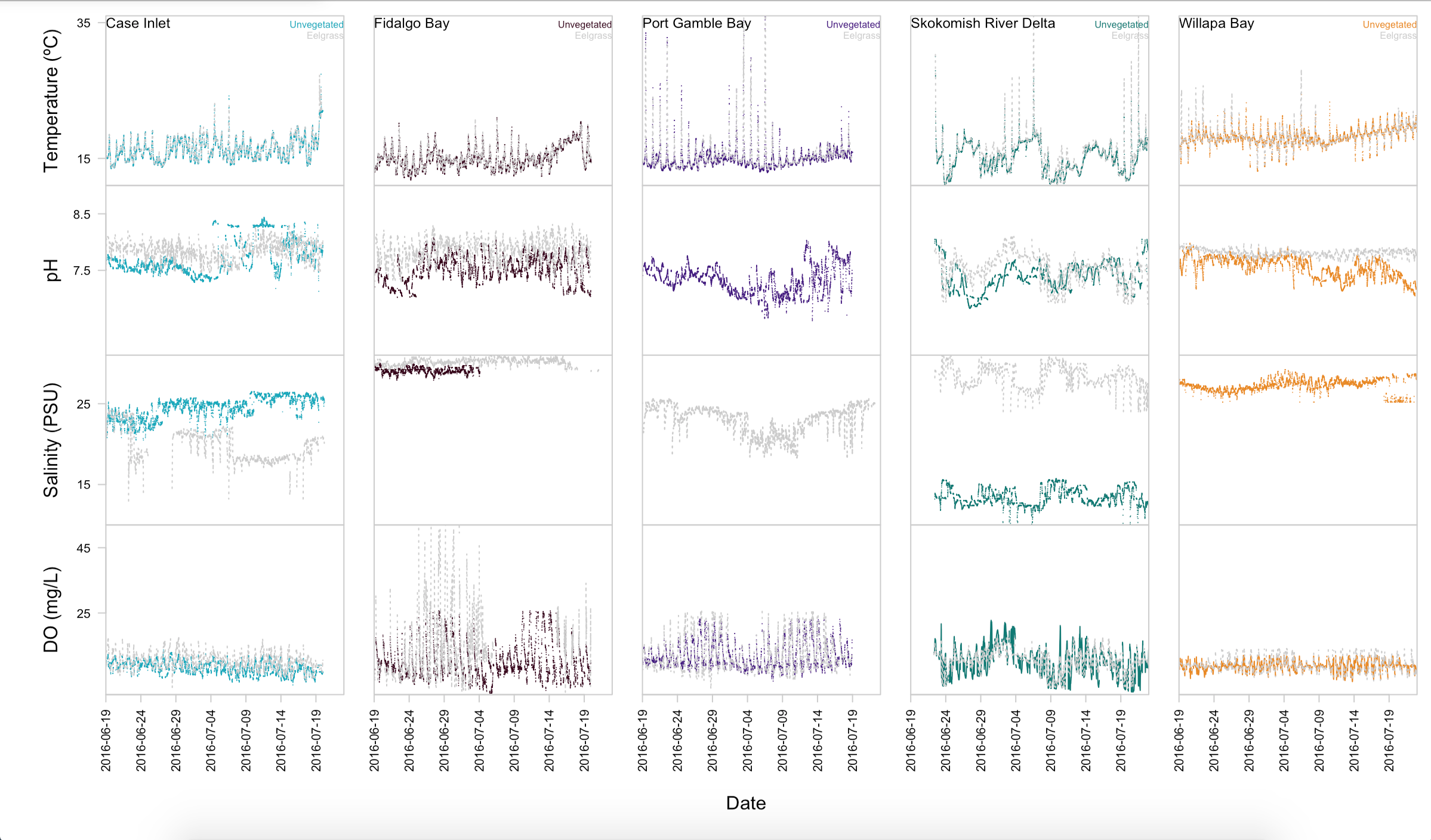
Displaying environmental data
I wanted a better plot for my environmental data, so I made one over Thanksgiving! Note how it uses the same colors for each site as the multipanel plot :wink: The code can be found here.
 .
.
Figure 2. Environmental variables by site and habitat.
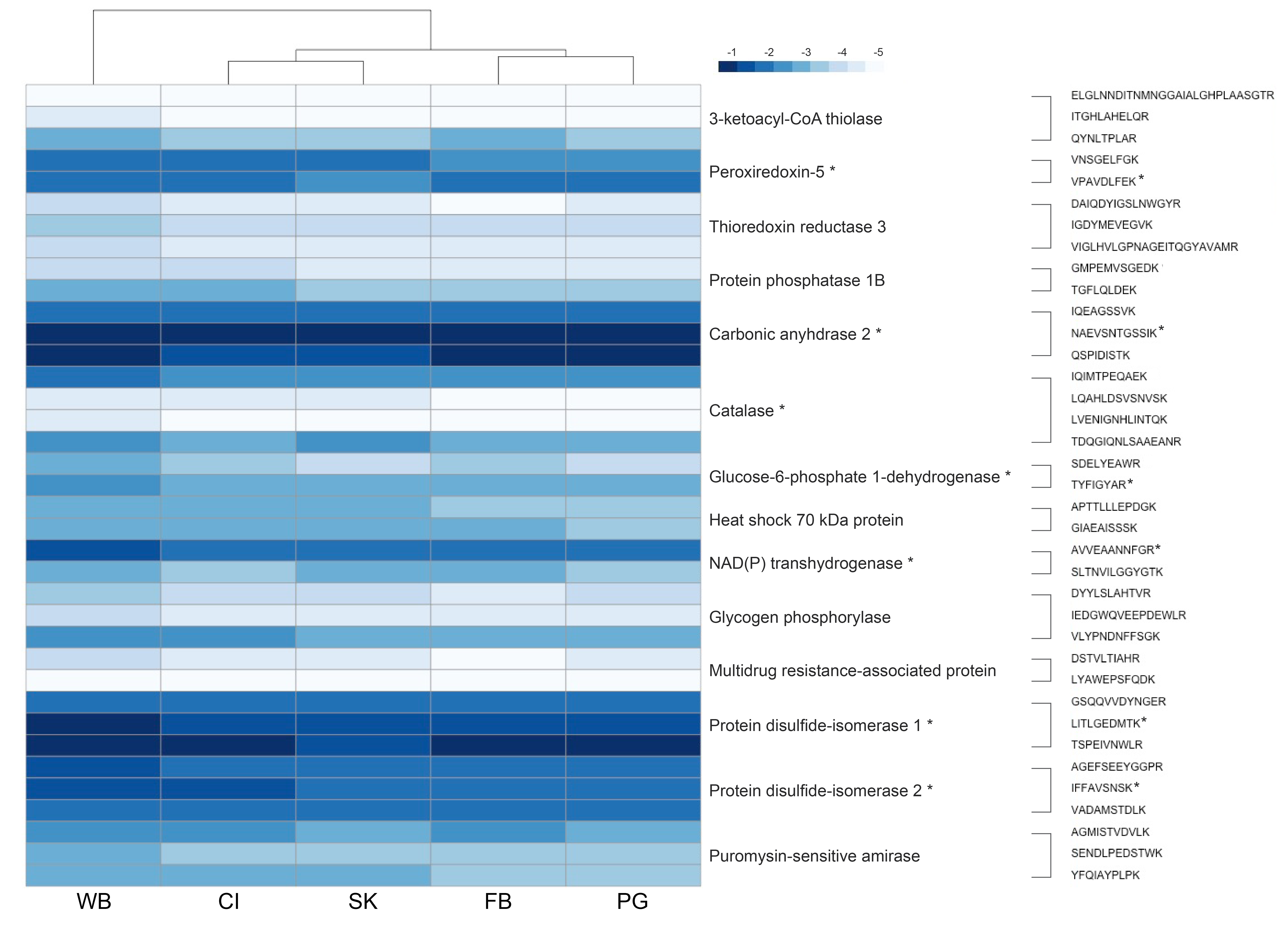
Protein abundance heatmap
As per reviewer suggestion, I changed the colors on my protein abundance heatmap (code here). In InDesign, I changed which peptides and proteins were marked as signficantly different. I know there’s a way I could do this in R, but it was 8 p.m. and I was in SAFS on a Saturday so…shrugs.
One important thing to note with the heatmap is that there are different proteins and peptides marked as significantly different! Most of the proteins are the same as what was in my original analysis, but some have been removed. Protein disulfide isomerase 1 and 2 are now identified as significantly different. This is something I need to alter in my results and discussion.
Going forward
- Update manuscript with new methods, results, and figures
- Tweak discussion
- Address remaining reviewer comments
- Send to co-authors!