Preliminary Data Analysis
On that number-crunching grind
Using the Skyline output I generated from an oyster seed .blib and my raw data, it’s time for me to understand what everything means. My goal is to get figures I can use for my NSA poster.
My methods can be found in this notebook, but here are the highlights.
Data exploration and Ratio Analysis
I used Average Peak Area statistics for my analysis. The data for approximately 6900 proteins looked like this:
I calculated ratios of eelgrass:bare areas across the five sites with the intention of using this information to pare down my dataset. However, I chose a different method of finding proteins of interest that suited our data more.
Preliminary Plots
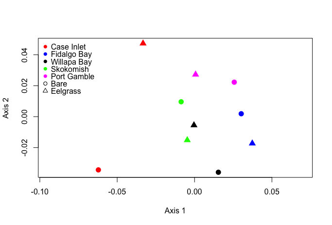
Using the entire dataset, I created an NMDS plot and heatmap. Unsurprisingly, it wasn’t very informative.
Preliminary Enrichment and REVIGO analysis
I used DAVID to find proteins overrepresented in all of my samples. One of the pathways that was overrepresented involved carbohydrate metabolism.
I produced a plot with 44 of my most significant biological processes GO terms in REVIGO.
Data Subsetting
Steven helped me create a subset of my data with C. gigas proteins involved in stress response. I merged one of Rhonda’s tables with my Skyline output in Galaxy, and Steven selected proteins of interest.
Using this subset, I calculated the coefficient of variation across all sites and eelgrass condition for each protein listed.
Subset Enrichment and REVIGO analysis
I returned to DAVID and REVIGO to create a plot for biological processes overrepresented in my data subset.
I also used my coefficient of variation data and GO IDs to create a similar REVIGO plot.
Subset Plots
Finally, I remade NMDS and heatmap plots for the data subset. The NMDS was more useful with the data subset, showing evidence of clustering between sites.

The heatmap didn’t really change.
Now I’ll figure out which figures will tell a cohesive story for my poster!