
Remaining Analyses Part 17
I created a better figure!
In this script, I first separated my peptide abundance data by site. Then, I averaged peptide abundance at each site. I saved the datafram as a .csv here.
Using the dotchart function in R, I created two plots that I can use as the cornerstone of my DNR paper. The first figure I made included all of my data, which Brent suggested.
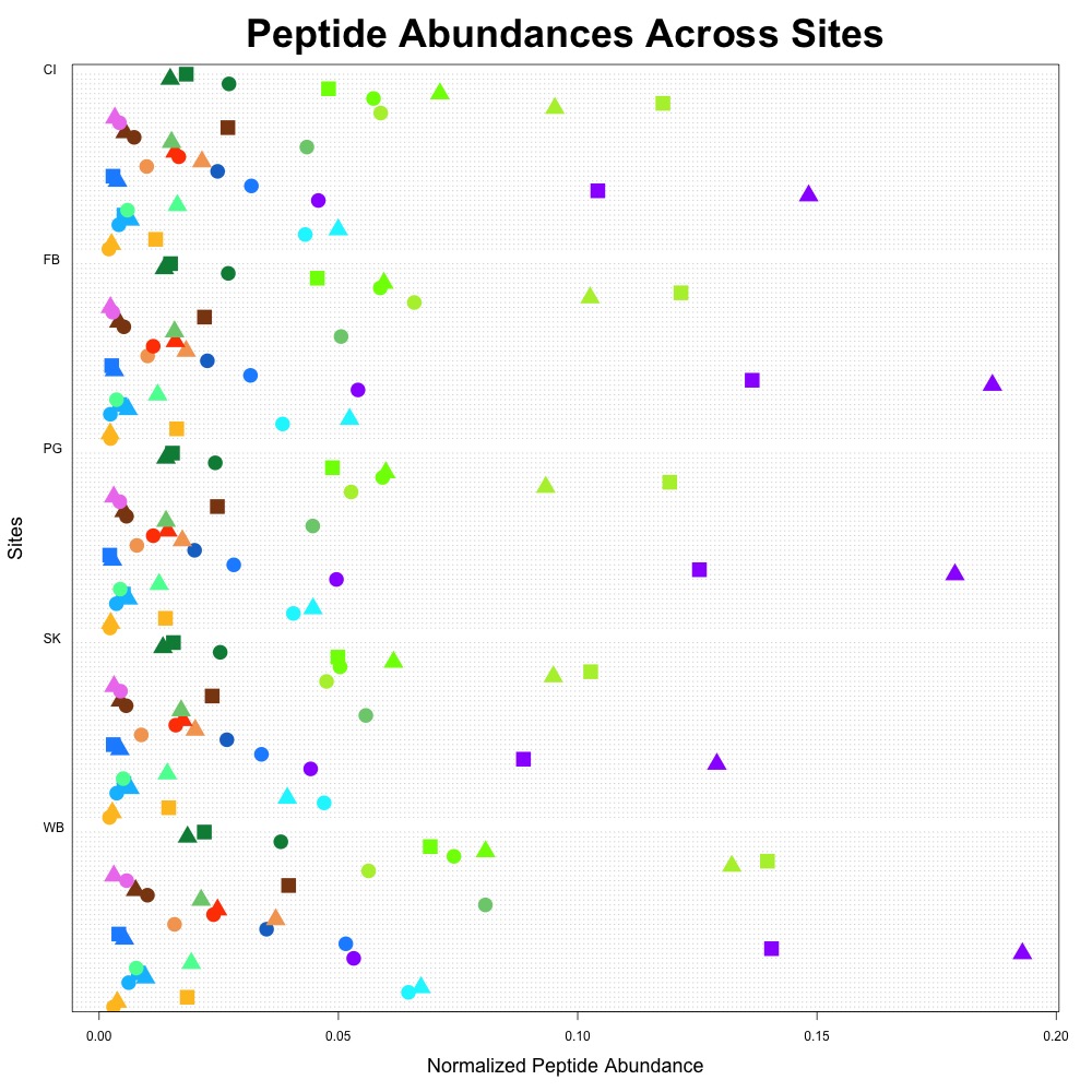
Figure 1. Average peptide abundance data across all sites.
Each protein is coded with the same color, and with different shapes indicating the constituent peptides. I also used this color scheme to indicate protein function:
- Oxidative stress: blue
- Heat shock: orange/red
- Acid-base balance: purple
- Drug resistance: pink
- Fatty acid metabolism: yellow
- Carbohydrate metabolism: brown
- Cell growth and maintenance: green
I didn’t add a legend, since I thought I’d first get feedback on the figure, then make it better. The downside with this graph is that there are 37 peptides at 5 different locations in this one figure, so it’s a little busy.
I decided to narrow down the figure to the peptides were differentially expressed. I highlighted the differentially expressed peptides in the figure below.
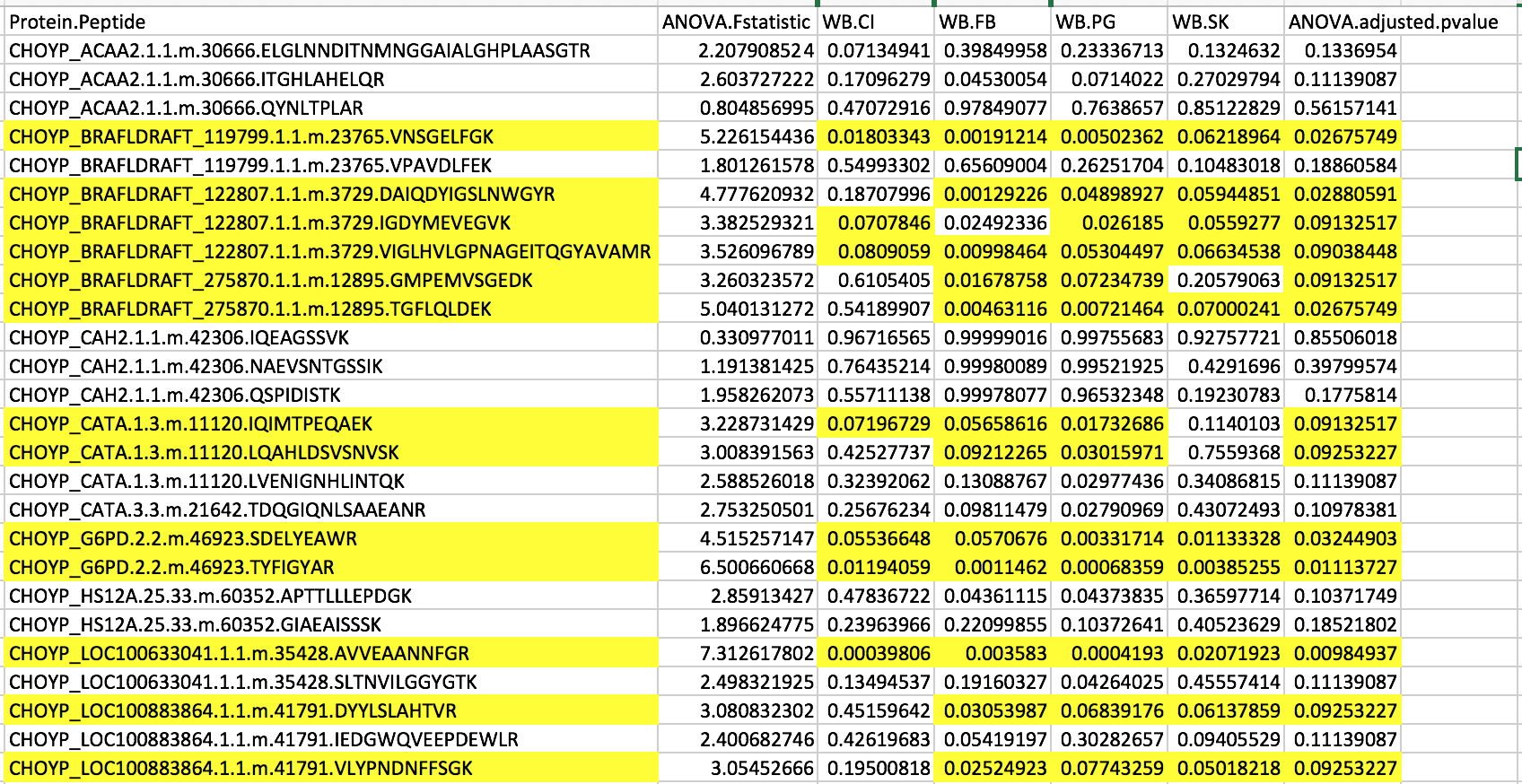
Figure 2. List of differentially expressed peptides.
I noticed that heat shock protein wasn’t included in this list since I revised p-values! There are 16 total differentially expressed peptides. I then used this dataset to remake my figure.
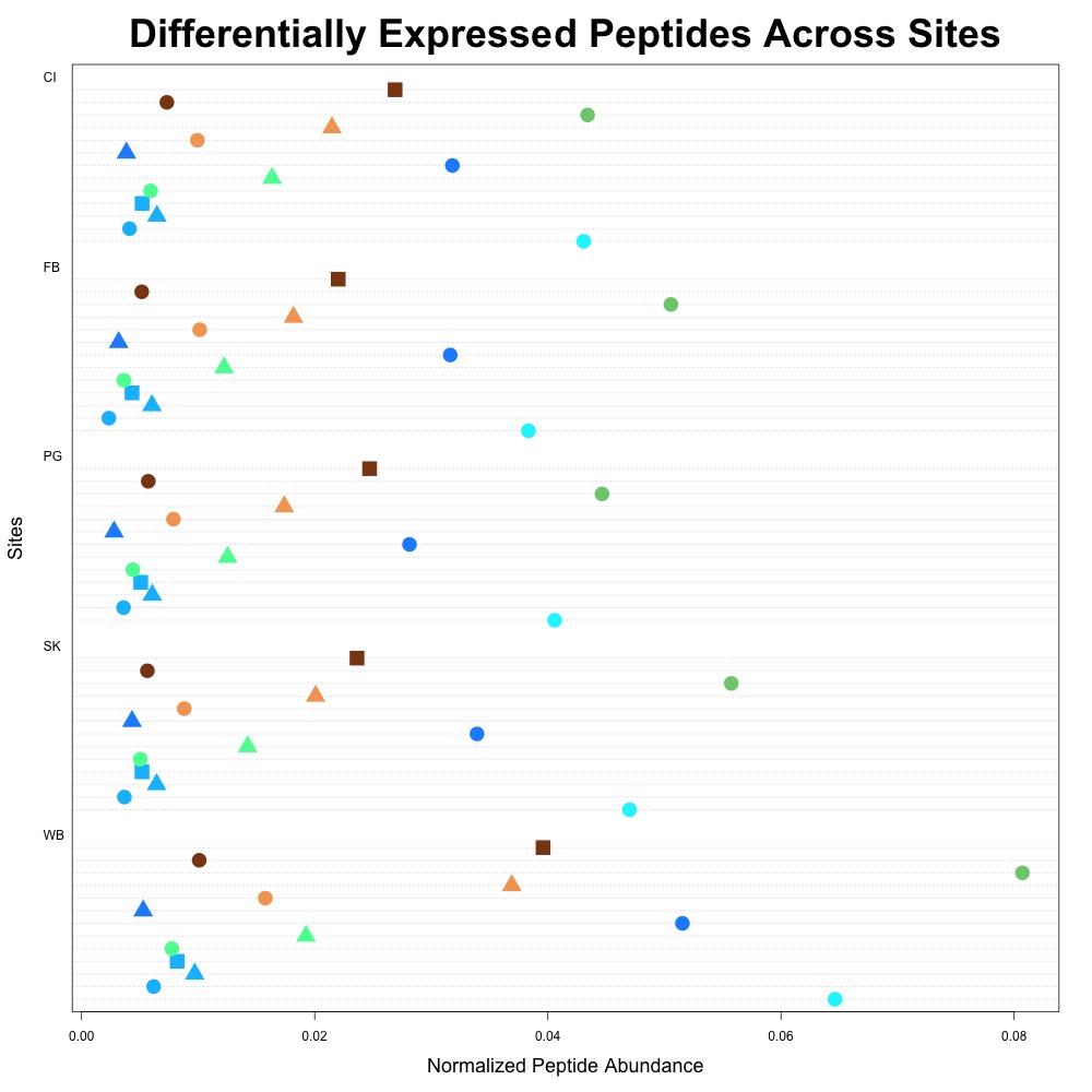
Figure 3. Differentially expressed average peptide abundance across all sites.
This figure is cleaner. We’ll see what Steven, Brent and Emma think at our meeting on Tuesday!