
Remaining Analyses Part 18
My better figure wasn’t actually good
I went back to the (digital) drawing board to make some more options.
Option 1: Dot charts
But this time, larger dots.
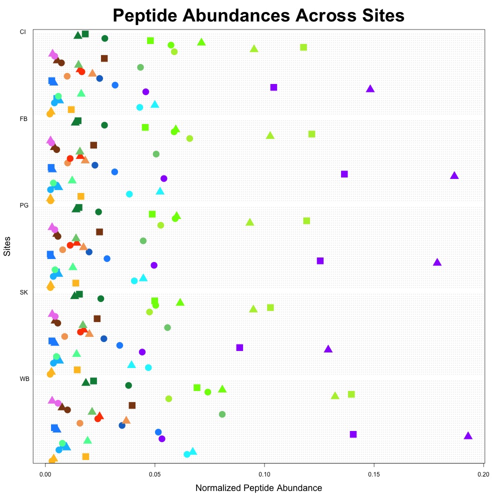
Figure 1. Average peptide abundance data across all sites.
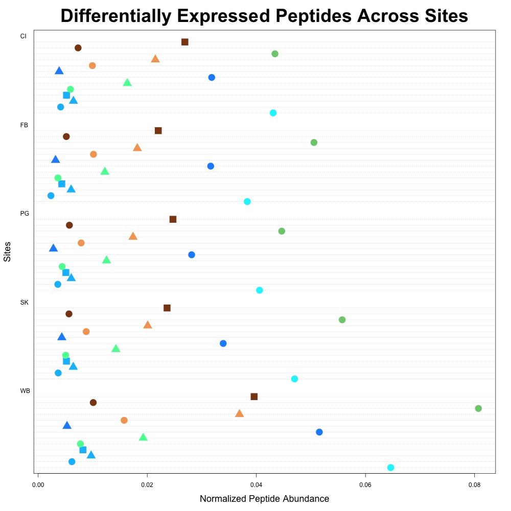
Figure 2. Differentially expressed average peptide abundance across all sites.
Option 2: Heatmaps
There aren’t large differences in the colors themselves (especially when looking at the figure with all peptide abundance data), so it’s not that exciting.
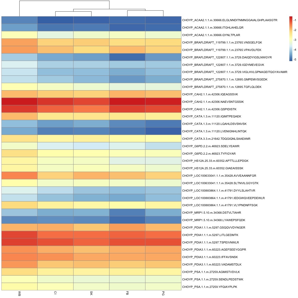
Figure 3. Average peptide abundance heatmap.
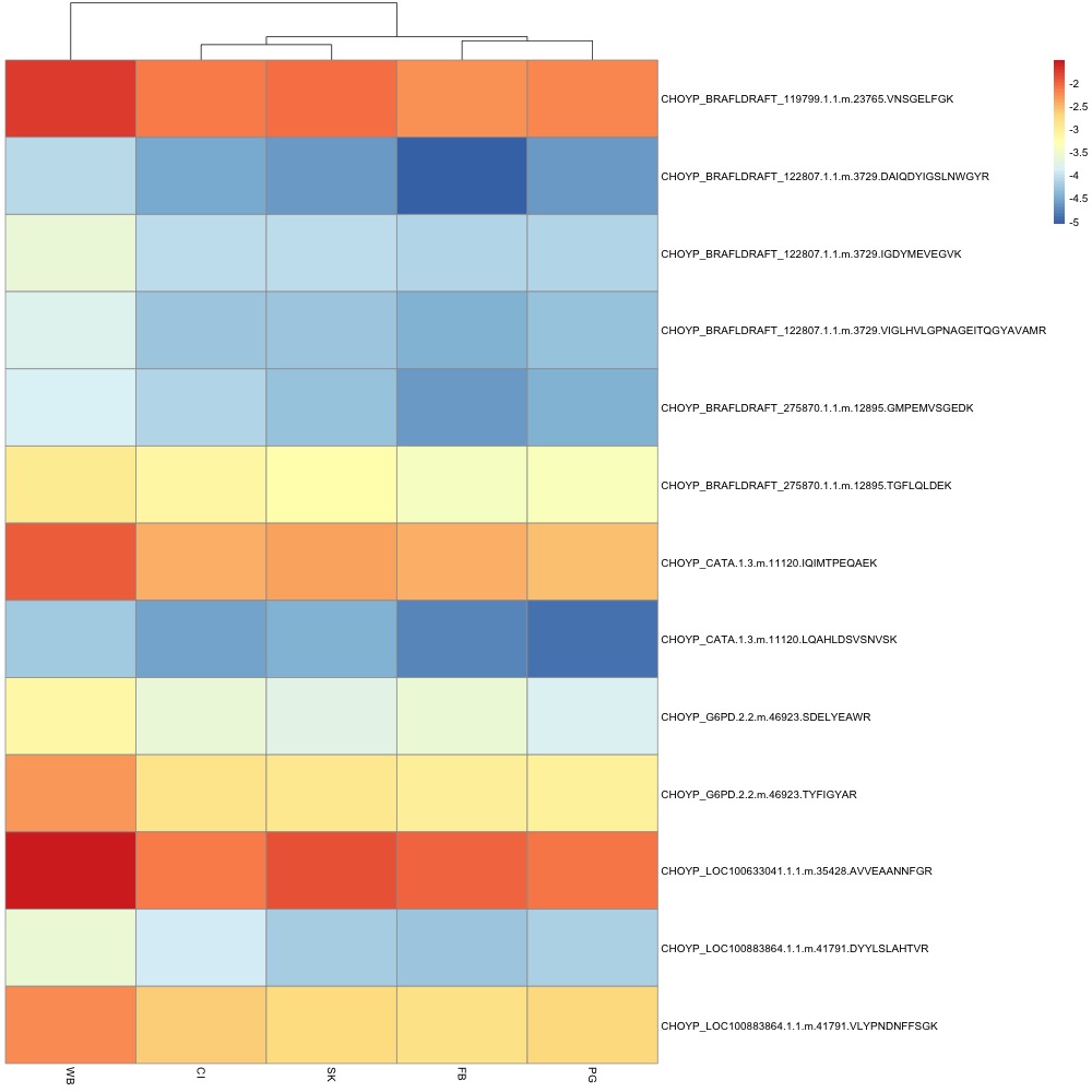
Figure 4. Differentially expressed average peptide abundance across all sites.
Option 3: Bubble plot
I like Figure 6 more than Figure 5. If possible, I could scale all data by the smallest value to make the bubble sizes bigger and more dramatic.
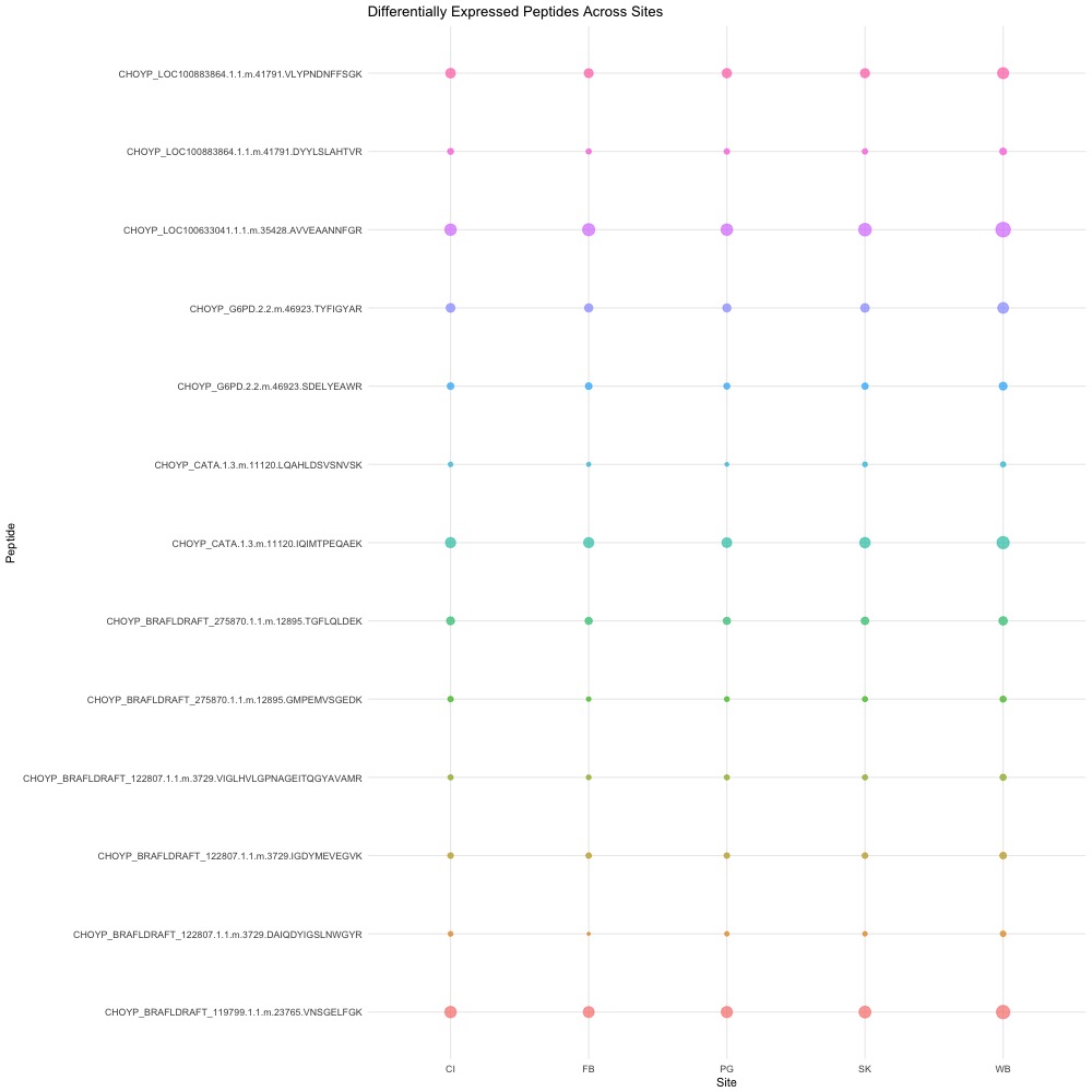
Figure 5. Average normalized abundance across sites for each peptide. The points themselves are scaled such that larger points represent higher peptide abundance.
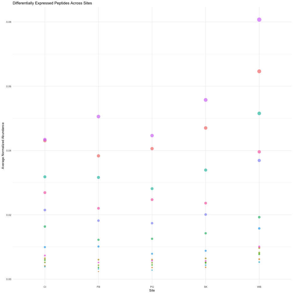
Figure 6. Average normalized abundance across sites. Points are scaled such that larger points represent higher peptide abundance, but all site data is grouped together. Points are color coded by peptide.
Option 4: Beeswarm plots
Suggestion from Steven! I think it’s a step up from the dot charts, but maybe not the best.
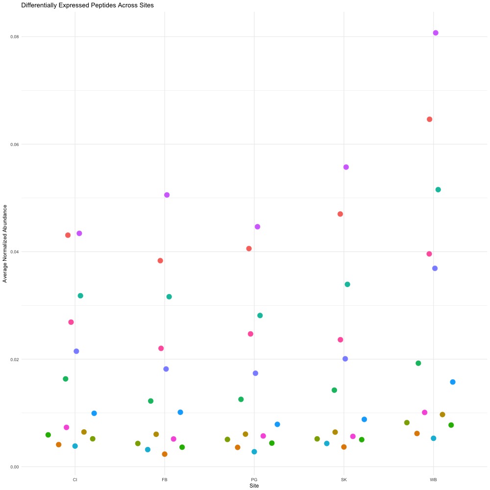
Figure 7. Beeswarm plot.
I wanted to make a volcano plot but it did not seem possible with my dataset. Perhaps I’m not searching for the right things in Google.