
SRM Transition Protein Analysis
If you don’t have a visualization, did you really analyze data?
Now that I have some downtime before I can analyze my SRM data, I want to visualize my SRM transitions. I figured the easiest way to do this would be to focus on the proteins I chose. The past few times I made NMDS plots, heatmaps and REVIGO plots, so I thought I would do the same this time. I used code in this R script.
NMDS plot
![]()
I ended up with all but one site and eelgrass condition nested on top of eachother. Not entire sure waht this means. I’ll need to consult Emma to ensure that I did this correctly.
Heatmap
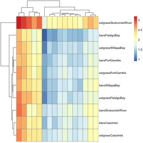
My heatmap is a much cleaner way to visualize the proteins I selected for my final transition list, and how the expression differs between sites.
REVIGO
After I exported a list of proteins, GOterms and p-values, I sorted through the list and picked the lowest p-value for each protein (all 20 replicates were listed) and only kept the first GOterm listed in the original “goterm” column. The resultant file can be found here.
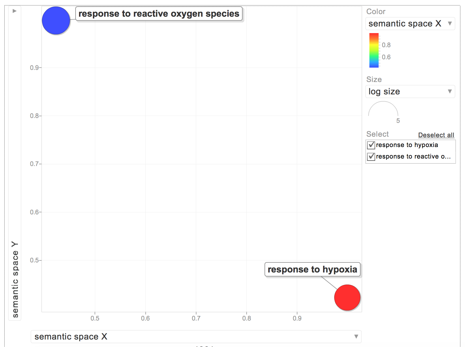
When I put the GOterms and p-values into REVIGO, I only had 2 biological process GOterms:
The rest were for molecular functions:
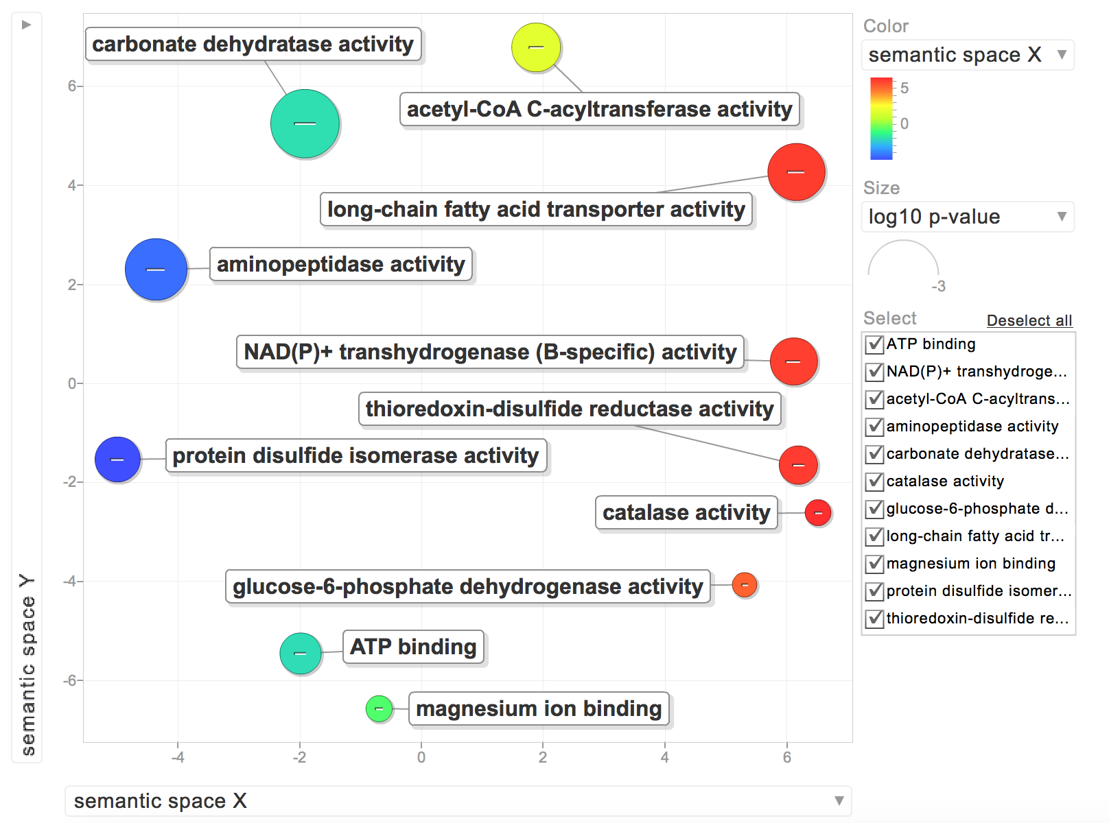
While interesting, I’d rather have all of my GOterms be relevant to a biological process. I need to find an efficient way to sort through my list of GOterms and see if they are for biological processes. I posted this Github issue to figure it out. Based on Steven’s comments, I’m going to forgo any REVIGO visualization since it may not be the most appropriate. I’ll stick with my heatmap for now!