
CEABiGR Part 9
Transcriptional noise analysis
Talking with Steven, Sam White, Sam Bogan, and Katie, I’ve finalized methods for a transcriptional noise analysis! The goal of this analysis is to understand how methylation and gene expression shape gene expression variability, which we call transcriptional noise. Wu et al. (2020) had a model like this:
log10(CV expression) ~ methylation + log2(expression) + gene length + treatment
The first model I tried was like this:
log10(CV expression) ~ methylation + log2(expression) + log10(CV methylation) + gene length + predominant isoform shift + treatment
This model was complicated to interpret, since I had methylation and expression at the sample level, gene length and predominant isoform shift at the gene level, and CV methylation and treatment at the treatment level. Katie suggested I modify my input dataframe so everything is at the gene level. This means for each gene, there is one line for control pH and one line for low pH information. She also suggested I remove predominant isoform shift from the model, since those values depend on treatment and expression already. Some initial plots suggested there’s an interaction between methylation or expression and treatment, so I added interaction terms as well. My final model to test now looks like this:
log10(CV expression) ~ methylation + log2(expression) + log10(CV methylation) + gene length + treatment + methylationtreatment + log2(expression)treatment
Dataframe manipulation
First things first: gotta modify my dataframes. To do this, I added summarise to my initial dataframe creation for gene methylation or expression. This allowed me to average methylation or expression values across samples for the same treatment:
geneMethylationFem <- geneMethylationMod %>%
  filter(., grepl("F", rownames(.), fixed = TRUE)) %>%
  t(.) %>%
  as.data.frame(.) %>%
  drop_na(.) %>%
  as.data.frame(.) %>%
  rownames_to_column(., var = "gene_name") %>%
  pivot_longer(., !gene_name, names_to = "sample", values_to = "meth") %>%
  mutate(., gene_name = gsub(pattern = "gene.", replacement = "", gene_name)) %>%
  left_join(., metadata, by = "sample") %>%
  select(., c(gene_name, meth, treatment)) %>%
  dplyr::group_by(gene_name, treatment) %>%
  summarise(avg_meth = mean(meth, na.rm = TRUE)) %>%
  ungroup(.) #Filter female samples and reformat data. Remove excess information from gene name column. Add treatment information and average methylation for each gene by treatment.
head(geneMethylationFem) #Confirm formatting. Resultant df has one line per gene/treatment.
I then used a series of join commands to get the input dataframe for analysis. I added some information on bins for expression and methylation for visualization and interpretation purposes:
femMethExp <- inner_join(geneMethylationFem, geneExpressionFem, by = c("gene_name", "treatment")) %>%
  inner_join(., predIsoFemFilt, by = "gene_name") %>%
  select(., 1:6) %>%
  mutate(meth_bins = case_when(avg_meth < 10 ~ "0",
                               avg_meth >= 10 & avg_meth < 20 ~ "10",
                               avg_meth >= 20 & avg_meth < 30 ~ "20",
                               avg_meth >= 30 & avg_meth < 40 ~ "30",
                               avg_meth >= 40 & avg_meth < 50 ~ "40",
                               avg_meth >= 50 & avg_meth < 60 ~ "50",
                               avg_meth >= 60 & avg_meth < 70 ~ "60",
                               avg_meth >= 70 & avg_meth < 80 ~ "70",
                               avg_meth >= 80 & avg_meth < 90 ~ "80",
                               avg_meth >= 90 & avg_meth < 100 ~ "90",
                               avg_meth >= 100 ~ "100")) %>%
  mutate(exp_bins = case_when(avg_exp < 10 ~ "0",
                              avg_exp >= 10 & avg_exp < 20 ~ "10",
                              avg_exp >= 20 & avg_exp < 30 ~ "20",
                              avg_exp >= 30 & avg_exp < 40 ~ "30",
                              avg_exp >= 40 & avg_exp < 50 ~ "40",
                              avg_exp >= 50 & avg_exp < 60 ~ "50",
                              avg_exp >= 60 & avg_exp < 70 ~ "60",
                              avg_exp >= 70 & avg_exp < 80 ~ "70",
                              avg_exp >= 80 & avg_exp < 90 ~ "80",
                              avg_exp >= 90 & avg_exp < 100 ~ "90",
                              avg_exp >= 100 ~ "100"))
Then added CV methylation information:
femMethExpCV <- inner_join(femMethExp, cov_data_fem, by = c("gene_name", "treatment")) %>%
  inner_join(., methCovDataFem, by = c("gene_name", "treatment")) %>%
  select(., -c(t_name, sex)) %>%
  distinct(.) #Join CV information for expression and methylation with gene-level expression and methylation data for each sample.
Female model
There were 9,854 unique genes for females in my input dataframe. When I ran the model, all input factors had a significant influence on transcriptional noise:
transNoiseFem <- lm(data = femMethExpCV,
                    log10(CoV_FPKM) ~ avg_meth + log10(CoV_Meth) + log2(avg_exp + 1) + log10(length) + as.factor(treatment) + as.factor(treatment)*avg_meth + as.factor(treatment)*log2(avg_exp + 1))
summary(transNoiseFem) #Significant effect of all parameters.
Call:
lm(formula = log10(CoV_FPKM) ~ avg_meth + log10(CoV_Meth) + log2(avg_exp +
    1) + log10(length) + as.factor(treatment) + as.factor(treatment) *
    avg_meth + as.factor(treatment) * log2(avg_exp + 1), data = femMethExpCV)

Residuals:
     Min       1Q   Median       3Q      Max
-1.11115 -0.13203 -0.00063  0.13135  0.85998

Coefficients:
                                                Estimate Std. Error t value Pr(>|t|)
(Intercept)                                    0.0540359  0.0155472   3.476 0.000511 ***
avg_meth                                      -0.0044841  0.0001180 -38.000  < 2e-16 ***
log10(CoV_Meth)                                0.1075580  0.0054311  19.804  < 2e-16 ***
log2(avg_exp + 1)                             -0.0329777  0.0016696 -19.752  < 2e-16 ***
log10(length)                                  0.0142692  0.0038076   3.748 0.000179 ***
as.factor(treatment)exposed                   -0.0509738  0.0046439 -10.976  < 2e-16 ***
avg_meth:as.factor(treatment)exposed           0.0003249  0.0001438   2.259 0.023870 *
log2(avg_exp + 1):as.factor(treatment)exposed -0.0330139  0.0023351 -14.138  < 2e-16 ***
---
Signif. codes:  0 ‘***’ 0.001 ‘**’ 0.01 ‘*’ 0.05 ‘.’ 0.1 ‘ ’ 1

Residual standard error: 0.2006 on 19641 degrees of freedom
Multiple R-squared:  0.5547,	Adjusted R-squared:  0.5546
F-statistic:  3496 on 7 and 19641 DF,  p-value: < 2.2e-16
I then followed these instructions to look at model residuals. To meet model assumptions, model residuals had to be normal and the variance of the residuals should be consistently and randomly distributed (cannot be heteroskedastic).
hist(residuals(transNoiseFem)) #Residuals normally distributed

plot(fitted(transNoiseFem), residuals(transNoiseFem)) #Variance of residuals roughly consistent for all observations. Borderline heteroscedasticity but probably okay...?
abline(h = 0, lty = 2, col = "grey")
I thought the variance plot was slightly verging on being conical, but I think it’s okay. Overall the model is good!
During EPIMAR, Jeremie asked if I did a variance partitioning analysis. After many Google searches, I finally talked to some of my SAFS cohort and learned that I could do a partial R2 analysis. Partial R2, or the coefficient of partial determination, quantifies how much variation in the response variable is explained by the explanatory variable. This can show how “important” one variable is in the model. To calculate partial R2, I divided the sum of squares for each model variable by the total sum of squares (including residuals). I got the sum of squares from anova output:
anova(transNoiseFem)
Analysis of Variance Table

Response: log10(CoV_FPKM)
                                          Df Sum Sq Mean Sq   F value    Pr(>F)
avg_meth                                   1 811.76  811.76 20175.538 < 2.2e-16 ***
log10(CoV_Meth)                            1  36.33   36.33   903.021 < 2.2e-16 ***
log2(avg_exp + 1)                          1  66.37   66.37  1649.482 < 2.2e-16 ***
log10(length)                              1   0.64    0.64    15.991 6.389e-05 ***
as.factor(treatment)                       1  58.20   58.20  1446.531 < 2.2e-16 ***
avg_meth:as.factor(treatment)              1   3.22    3.22    80.024 < 2.2e-16 ***
log2(avg_exp + 1):as.factor(treatment)     1   8.04    8.04   199.892 < 2.2e-16 ***
Residuals                              19641 790.25    0.04
---
Signif. codes:  0 ‘***’ 0.001 ‘**’ 0.01 ‘*’ 0.05 ‘.’ 0.1 ‘ ’ 1
transNoiseFemVP <- data.frame("variable" = rownames(anova(transNoiseFem)),
                              "SumSq" = anova(transNoiseFem)[[2]],
                              "partialR2" = NA) #Create dataframe with variable names and sum of squares information from ANOVA output

for (i in 1:nrow(transNoiseFemVP)) {
  transNoiseFemVP$partialR2[i] <- transNoiseFemVP$SumSq[i] / sum(transNoiseFemVP$SumSq)
} #Calculate partial r2 by dividing sum of squares for each variable by total sum of squares (including residuals)
I saved a table with the calculations here. Based on the partial R2, methylation explains the most variation in the model (partial R2 = 0.46). This is interesting and exciting! However, the residuals have a partial R2 that’s pretty close (partial R2 = 0.45), meaning that there’s a lot of variation in transcriptional noise that’s unexplained by any variable in the model.
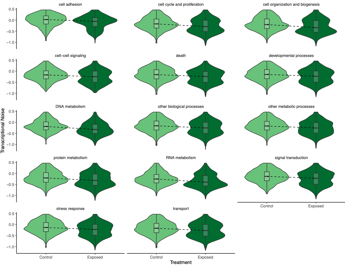
Back to the model output itself. Transcriptional noise has a negative relationship with methylation, expression, treatment, and the interaction between expression and treatment. However, there is a positive relationship between noise and CV methylation, length, and the interaction between methylation and treatment. I began plotting transcriptional noise versus these model inputs to understand the results. First, I looked at transcriptional noise versus treatment. I followed this example to draw a line that connected the boxplot medians. I thought this line would be helpful for showing the decrease in transcriptional noise between control and exposed oysters.
I looked at expression or methylation bins versus transcriptional noise.
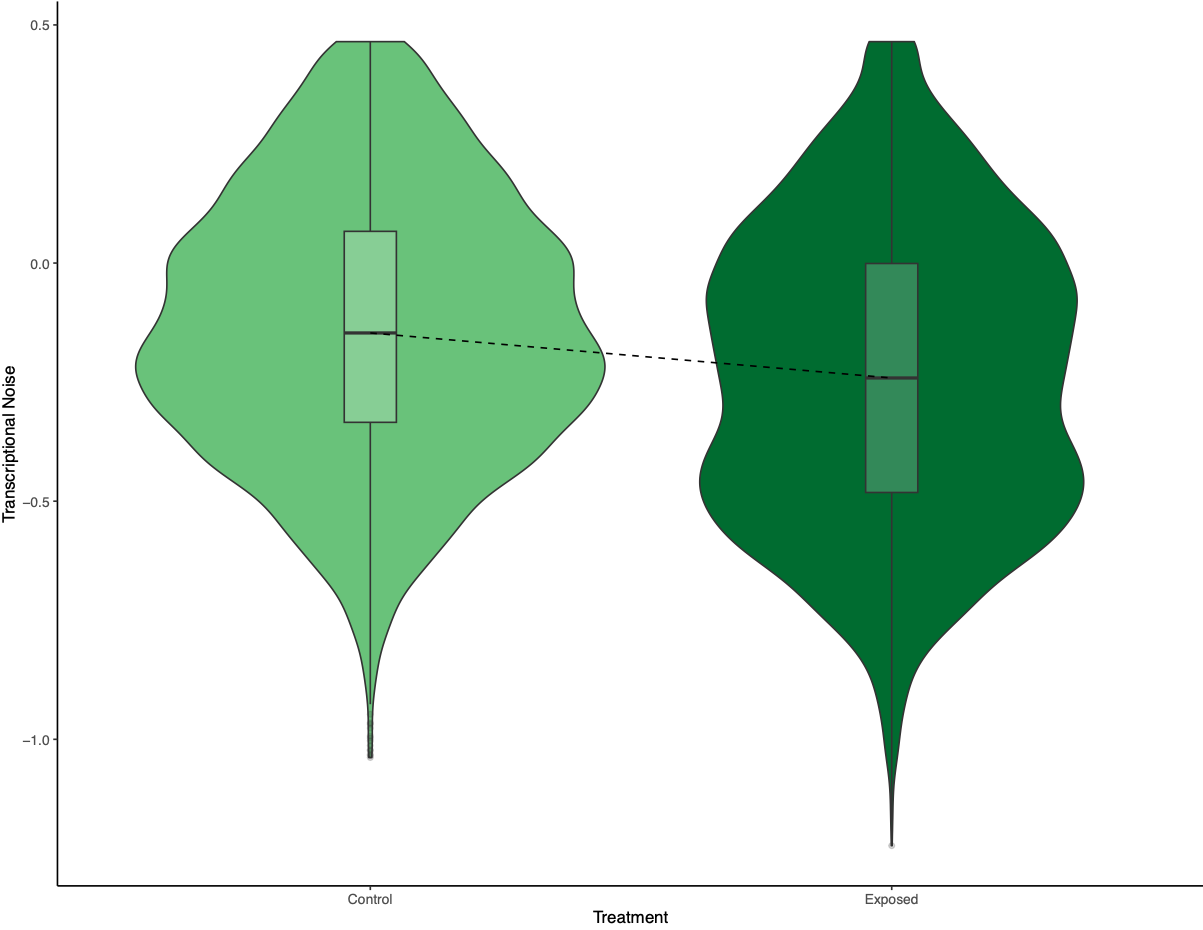
Figure 1. Transcriptional noise differences between treatment.
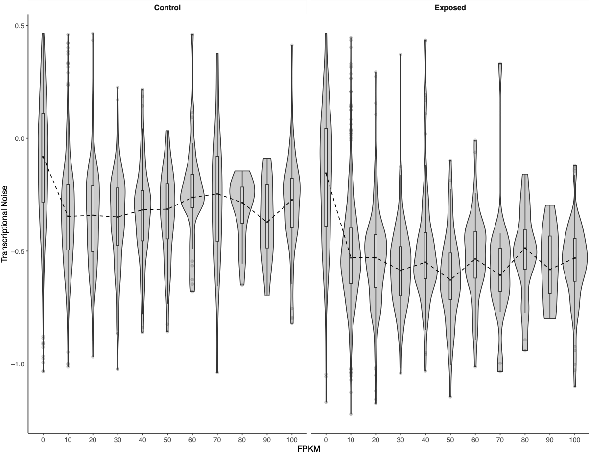
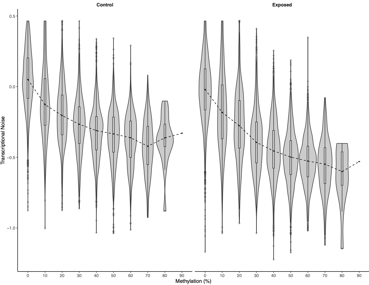
Figures 2-3. Bins of expression or methylation versus transcriptional noise.
There was a much cleaner negative relationship between methylation and transcriptional noise than FPKM and transcriptional noise. I then recreated the scatterplots from Wu et al. (2020) with linear model fits.
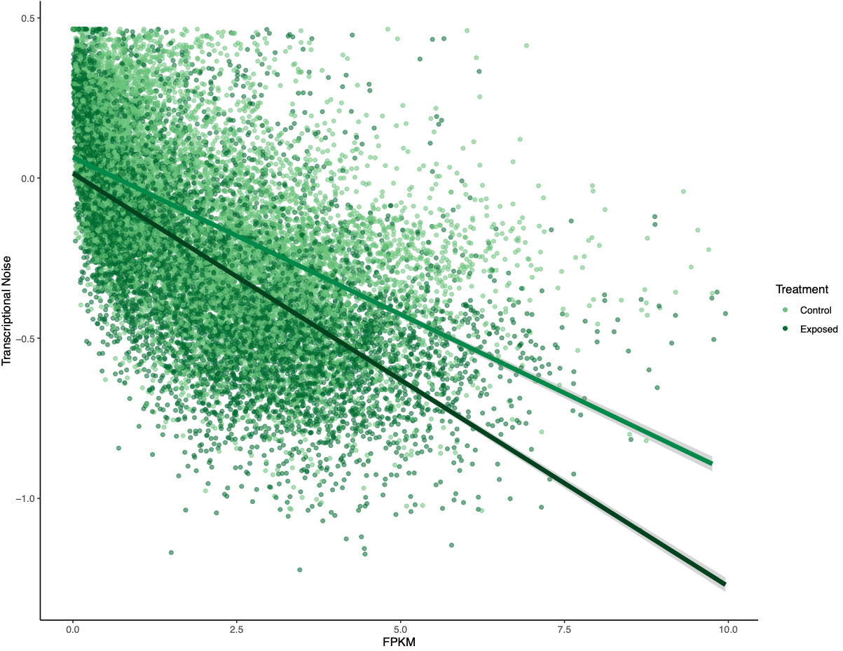
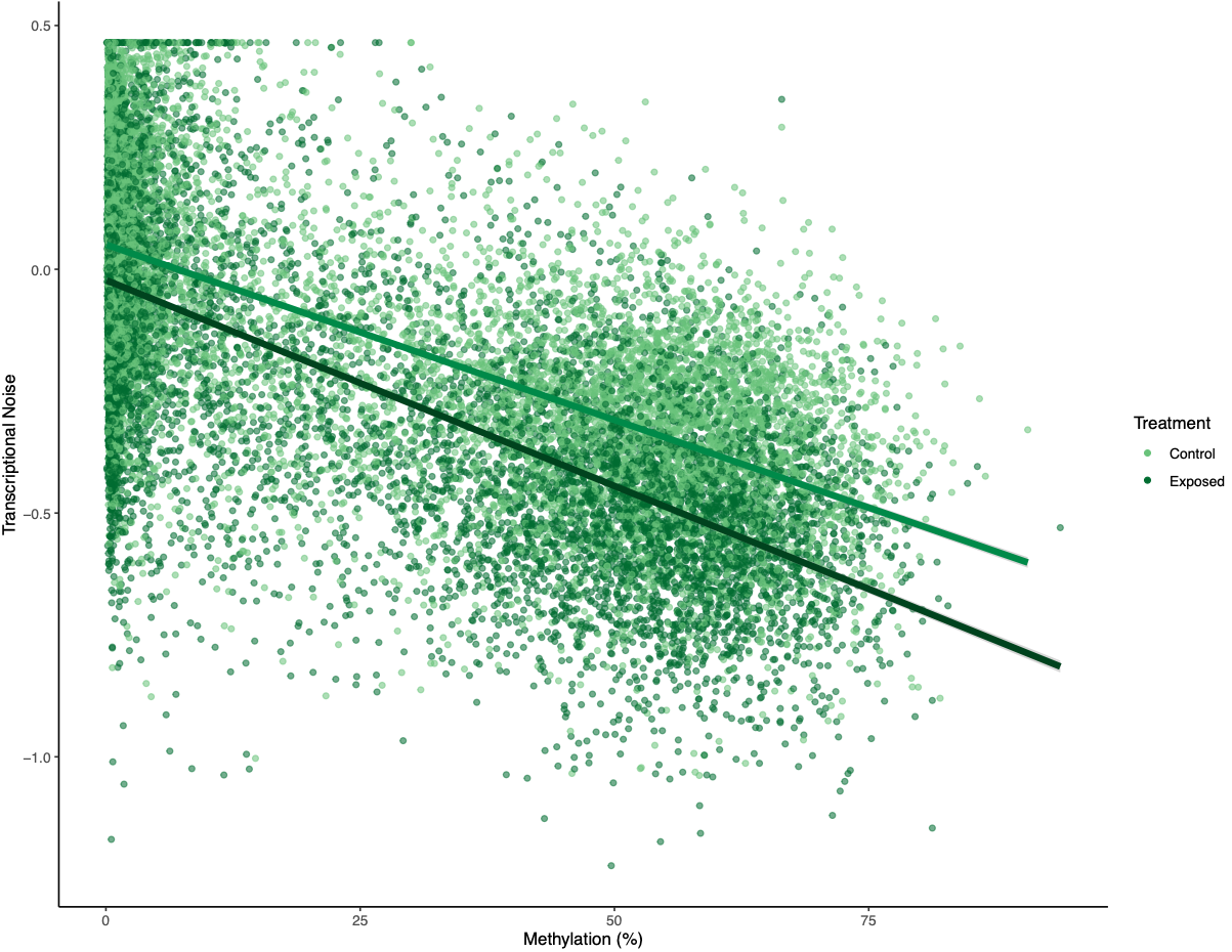
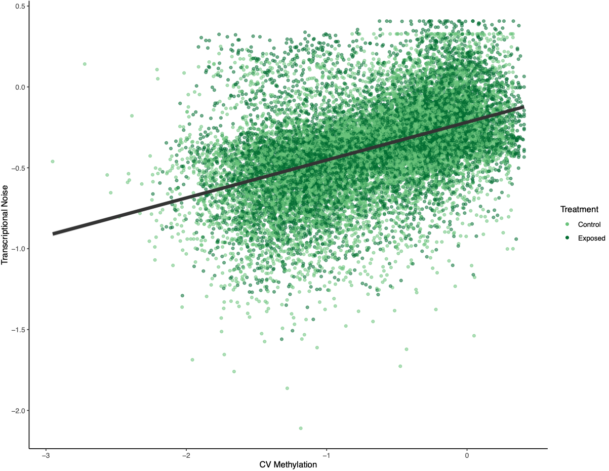
Figures 4-6. Gene-wise visualization of FPKM, methylation (%), or CV methylation vs. transcriptional noise. Linear model fits are displayed for values from control or exposed oysters.
There is lower transcriptional noise noise with higher gene expression expression, with exposed female oysters showing lower transcriptional noise. There are two potential explanations: 1) under low pH stress, there is a directed stress response such that multiple isoforms are not necessary or 2) the pattern is driven by gene function (housekeeping vs. environmental response gene). Increased methylation decreases transcriptional noise, with exposed female oysters still having lower overall transcriptional noise. Variation in methylation increases transcriptional noise. This fits in with the idea that stable methylation reduces spurious transcription or alternative splicing.
To investigate if gene function drove any of the patterns, Steven suggested making the same plots but faceting by GOslim term. I used mRNA track, GO term, and GO slim information to produce a dataframe with GO slim information for each gene before plotting:
femMethExpCV %>%
  left_join(., mRNATrack, by = "gene_name") %>%
  left_join(., GOterms, by = "transcript") %>%
  left_join(., GOslim, by = "GO") %>%
  select(., -c(transcript, gene, product, GO, GOterm)) %>%
  filter(., process == "P") %>%
  select(., -process) %>%
  distinct(.) %>%
  ggplot(aes(x = log2(avg_exp + 1), y = log10(CoV_FPKM))) + geom_point(aes(colour = treatment, alpha = 0.5)) +
  scale_colour_manual(values = c(plotColors[5], plotColors[8])) +
  labs(x = "FPKM", y = "Transcriptional Noise") +
  geom_smooth(data = (. %>% filter(treatment == "control")), method = lm, colour = plotColors[7], size = 1.5, na.rm = TRUE) +
  geom_smooth(data = (. %>% filter(treatment == "exposed")), method = lm, colour = plotColors[9], size = 1.5, na.rm = TRUE) +
  facet_wrap(. ~ GOslim, ncol = 3) +
  theme_classic() + theme(legend.position = "none",
                          strip.background = element_rect(linewidth = 0))
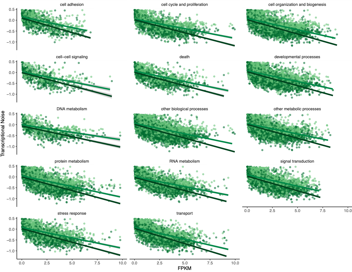
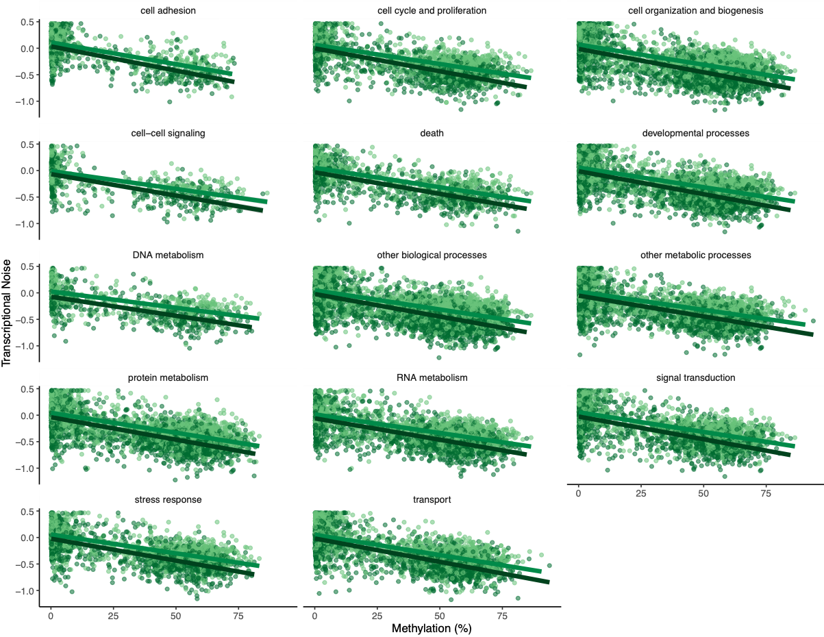
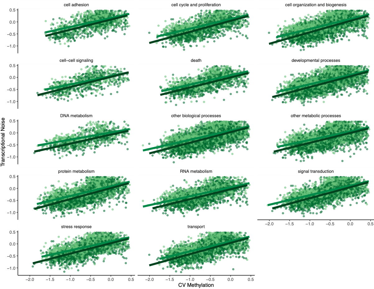
Figures 7-10. Influence of treatment, FPKM, methylation, and CV of methylation on transcriptional noise, faceted by GO slim term.
Genes associated with each GOslim category didn’t show a different pattern than the one in the main model. While this is fun to look at, I don’t think it provides any more information than we already have.
Of course, I created a multipanel plot with the main findings using some patchwork magic:
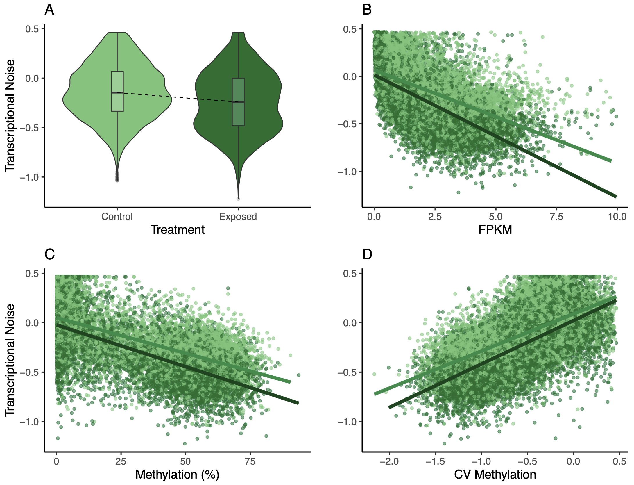
Figure 11. Multipanel plot of treatment, FPKM, methylation, and CV of methylation influence on transcriptional noise.
Male model
I repeated the process above for 9,944 unique genes in the male dataset. Interestingly, gene length, treatment, and the interaction between FPKM and treatment were not significant.
transNoiseMale <- lm(data = maleMethExpCV,
                     log10(CoV_FPKM) ~ avg_meth + log10(CoV_Meth) + log2(avg_exp + 1) + log10(length) + as.factor(treatment) + as.factor(treatment)*avg_meth + as.factor(treatment)*log2(avg_exp + 1))
summary(transNoiseMale) #Significant effect of all except length, treatment, and FPKM x treatment
Call:
lm(formula = log10(CoV_FPKM) ~ avg_meth + log10(CoV_Meth) + log2(avg_exp +
    1) + log10(length) + as.factor(treatment) + as.factor(treatment) *
    avg_meth + as.factor(treatment) * log2(avg_exp + 1), data = maleMethExpCV)

Residuals:
     Min       1Q   Median       3Q      Max
-1.57221 -0.12576 -0.00337  0.12467  0.99160

Coefficients:
                                                Estimate Std. Error t value Pr(>|t|)
(Intercept)                                   -0.1682555  0.0213433  -7.883 3.35e-15 ***
avg_meth                                      -0.0012590  0.0001048 -12.017  < 2e-16 ***
log10(CoV_Meth)                                0.1737629  0.0058656  29.624  < 2e-16 ***
log2(avg_exp + 1)                             -0.0259226  0.0029956  -8.654  < 2e-16 ***
log10(length)                                  0.0022439  0.0047048   0.477    0.633
as.factor(treatment)exposed                   -0.0066501  0.0117619  -0.565    0.572
avg_meth:as.factor(treatment)exposed           0.0006995  0.0001111   6.297 3.10e-10 ***
log2(avg_exp + 1):as.factor(treatment)exposed  0.0038735  0.0041566   0.932    0.351
---
Signif. codes:  0 ‘***’ 0.001 ‘**’ 0.01 ‘*’ 0.05 ‘.’ 0.1 ‘ ’ 1

Residual standard error: 0.2425 on 19837 degrees of freedom
Multiple R-squared:  0.2221,	Adjusted R-squared:  0.2218
F-statistic: 809.1 on 7 and 19837 DF,  p-value: < 2.2e-16
I removed these variables from the model, but I kept treatment since methylationtreatment was significant. I ran two models: one with treatment and methylationtreatment, and another without. I then used AIC to pick the most parsimonious model:
transNoiseMale2 <- lm(data = maleMethExpCV,
                      log10(CoV_FPKM) ~ avg_meth + log10(CoV_Meth) + log2(avg_exp + 1) + as.factor(treatment) + as.factor(treatment)*avg_meth)
transNoiseMale3 <- lm(data = maleMethExpCV,
                      log10(CoV_FPKM) ~ avg_meth + log10(CoV_Meth) + log2(avg_exp + 1))
AIC(transNoiseMale, transNoiseMale2, transNoiseMale3) #Model with treatment and meth*treatment term has lowest AIC, will use that model as the final one
model          df AIC
transNoiseMale	9	90.65897
transNoiseMale2	7	87.75041
transNoiseMale3	5	188.67963
Call:
lm(formula = log10(CoV_FPKM) ~ avg_meth + log10(CoV_Meth) + log2(avg_exp +
    1) + as.factor(treatment) + as.factor(treatment) * avg_meth,
    data = maleMethExpCV)

Residuals:
     Min       1Q   Median       3Q      Max
-1.57257 -0.12601 -0.00338  0.12450  0.99757

Coefficients:
                                       Estimate Std. Error t value Pr(>|t|)
(Intercept)                          -0.1634619  0.0062580 -26.121  < 2e-16 ***
avg_meth                             -0.0012772  0.0001033 -12.362  < 2e-16 ***
log10(CoV_Meth)                       0.1730381  0.0056515  30.618  < 2e-16 ***
log2(avg_exp + 1)                    -0.0243254  0.0021940 -11.087  < 2e-16 ***
as.factor(treatment)exposed           0.0034168  0.0048120   0.710    0.478
avg_meth:as.factor(treatment)exposed  0.0007288  0.0001063   6.854 7.39e-12 ***
---
Signif. codes:  0 ‘***’ 0.001 ‘**’ 0.01 ‘*’ 0.05 ‘.’ 0.1 ‘ ’ 1

Residual standard error: 0.2425 on 19839 degrees of freedom
Multiple R-squared:  0.2221,	Adjusted R-squared:  0.2219
F-statistic:  1133 on 5 and 19839 DF,  p-value: < 2.2e-16
The model with treatment and methylation*treatment had the lowest AIC, so I kept that as the final model. Again, I looked at residuals (all clear) and did a partial R2 analysis (outputhere). Unlike the female model, there was a much larger portion of variance that was unexplained (partial R2 = 0.78). Of the input variables, methylation did explain the most variation (partial R2 = 0.16).
Methylation and expression had negative relationships with transcriptional noise and CV methylation, just like for the female oysters. When thinking about why male oysters may not have a significant treatment effect, I came back to the differences between male and female gametes. Eggs are provisioned with maternal mRNA, while sperm are primarily DNA. Methylation may be an important mechanism for regulating maternal mRNA in different treatments for offspring fitness, whereas sperm don’t have a similar mechanism.
I went through the motions of plotting all the different relationships like I did for the female oysters, but I think the multipanel is the most useful.
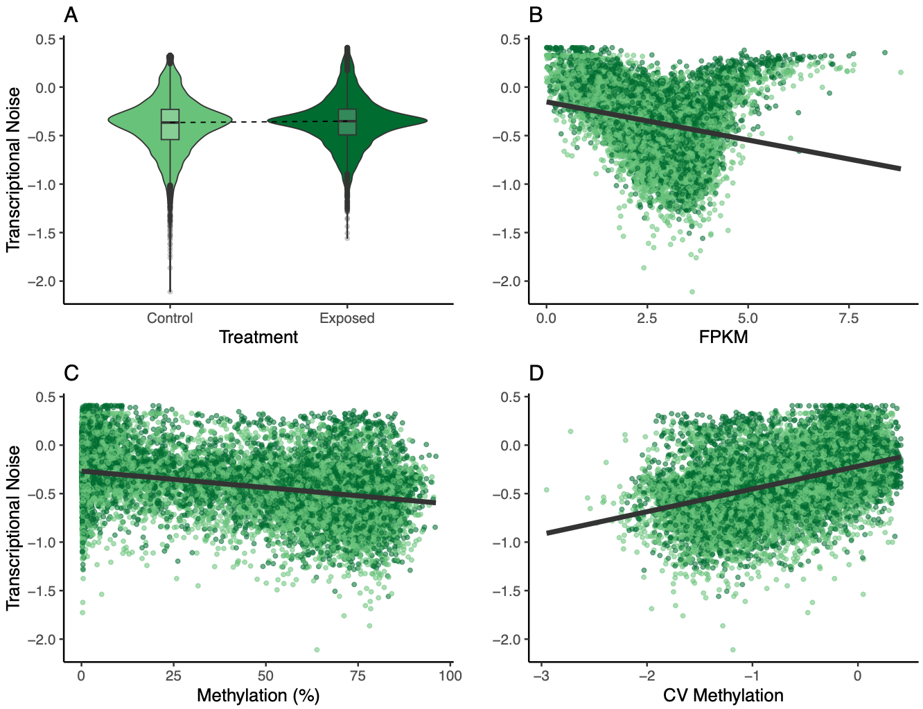
Figure 12. Multipanel plot of treatment, FPKM, methylation, and CV of methylation influence on transcriptional noise.
Going forward
- Investigate other layers of predominant isoform analysis
- Tune sPLS parameters
- Determine if outlier sample should be removed
- Re-run sex-specific SPLS
- Update methods and results
- Dig into functional annotations for genes in networks