
Remaining Analyses Part 8
Visualizing environmental and biomarker data
I spent time recently making some figures and trying to figure out which environmental variables and biomarkers could explain my protein expresison patterns.
Environmental variables:
Based on discussion from our second proteomics meeting, temperature looked like a candidate driver for protein expression differences in Willapa Bay. I visualized the diurnal fluctuations and added mean and median lines to a multipanel plot in this R script.
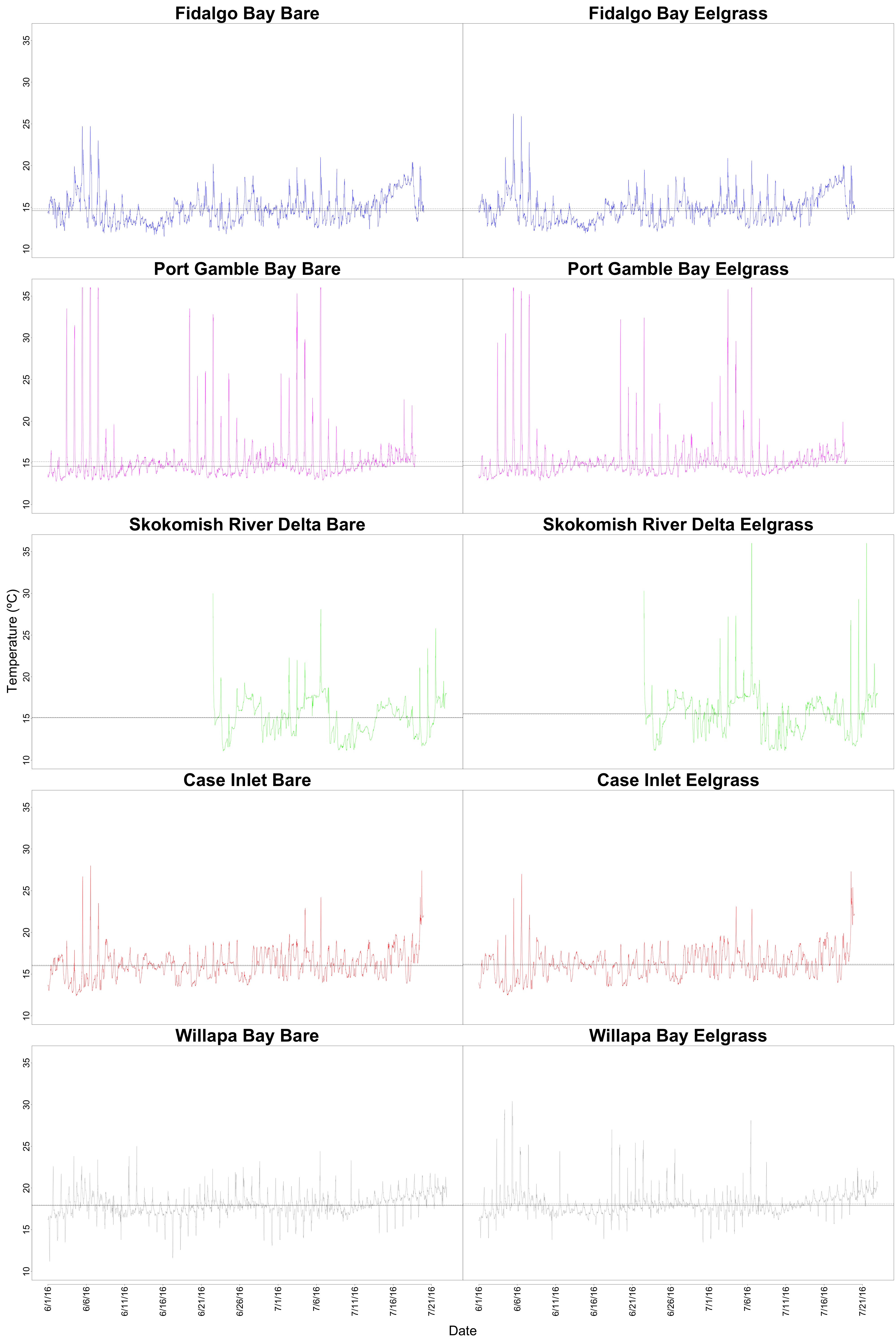
Figure 1. Diurnal temperature fluctuations within each site and habitat. The mean and median temperatures between habitats are not very different within sites, so it could be possible to pool or average the data somehow.
I also made a boxplot for temperatures at each site. The ANOVA was significant, and a post-hoc Tukey HSD test showed that all sites were significantly different from eachother. I think this is because of the fluctuations between each site. The next step would be to do a “sliding window analysis,” where I run an ANOVA for 14 time points between sites, move over 7 time points, and then run the ANOVA again. Essentially, I would be able to isolate windows of time where there were siginficant temperature differences and where there weren’t.
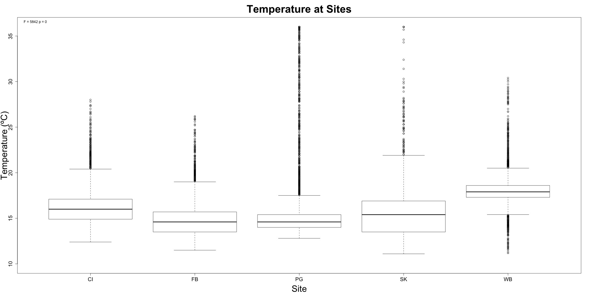
Figure 2. Temperature at each site. Willapa Bay had significantly different temperatures.u
I also played around with the idea of a multipanel plot that puts the diurnal fluctuations and temperature boxplot side-by-side. I only made one of these since I don’t know what Steven would think of it. I like how it shows which temperatures were “extremes” and when those extremes were.
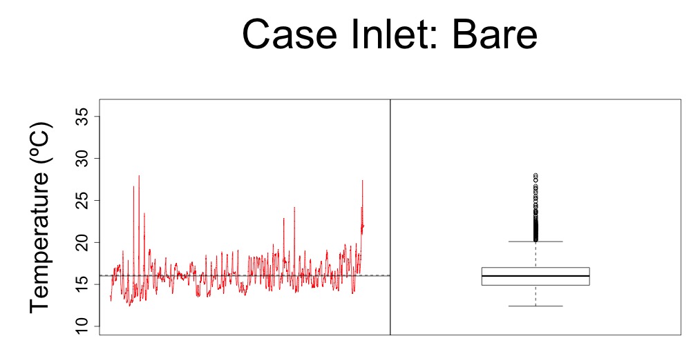
Figure 3. Multipanel plot with diurnal temperature fluctuations and quartiles for bare habitat at Case Inlet.
Micah sent over salinity data and low tide information, so I need to work with that to remove data we don’t trust from pH, DO and salinity. After that, I can see if any of those environmental variables explain higher protein abundance at Willapa Bay.
Biomarkers:
Alex sent over two different datasheets: data for all oysters he sampled and data for just the oysters I sampled. I decided to stick to the latter for now.
I generated boxplots for each biomarker in this R script. I then generated a table of ANOVA and Tukey HSD results. The annotated version can be found below.
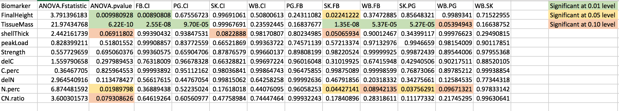
Figure 4. ANOVA and post-hoc Tukey HSD results.
None of the results really jump out as being explanations for higher protein abundance in Willapa Bay. Tissue mass is significantly different between Willapa Bay-Fidalgo Bay (p = 5.37e-05) and between Willapa Bay-Port Gamble Bay (p = 0.05394943). Percent N was also significantly different between Willapa Bay-Fidalgo Bay (p = 0.08942135) and Willapa Bay-Port Gamble Bay (p = 0.09671321). According to Alex’s notes, relatively higher percent N is a good thing, and Willapa Bay had higher percent N than Fidalgo Bay and Port Gamble Bay. I’ll run this by him on Friday when we meet.
My next step now is to tie together protein expression and these variables in one figure. To the (literal) drawing board!